Design News

Stay updated with the latest trends, tips and news from the design and technology world.

Why Retail Businesses Need Custom Android Mobile Applications The-digital-reader.com
Nov 12, 2026

Why Retail Businesses Need Custom Android Mobile Applications

Retailers' environment has transformed considerably with customers using smartphones for product discovery, price comparison and purchase. In today’s age, the traditional shopping approach is insufficient. Today, retail companies must provide digital solution…

2026 Jenkins Election Candidate Statements Jenkins.io
Nov 12, 2026

2026 Jenkins Election Candidate Statements

Candidate nominations for the 2026 Jenkins elections are now complete. Thanks to everyone who submitted nominations and to the candidates that have accepted the nominations. Candidate statements This announcement shares the election candidates and their s…

Raksha Rajya Mantri Launches Revamped Gallantry Awards Portal pragativadi
Nov 12, 2026

Raksha Rajya Mantri Launches Revamped Gallantry Awards Portal

Preserving India’s military heritage and honouring the supreme sacrifices of its armed forces, Minister of State for Defence (Raksha Rajya Mantri) Sanjay Seth officially launched the revamped Gallantry Awards Portal ([https://gallantryawards.gov.in](https://gallantryawards.gov.in)) in New Delhi on November 12, 2026. Designed as an authentic, comprehensive digital repository, the upgraded platform chronicles India’s wars, military operations, and the […] The post Raksha Rajya Mantri Launches Revamped Gallantry Awards Portal appeared first on Pragativadi I Latest Odisha News in English I Breaking News .

How AI Is Reshaping SAPUI5: From Development to Runtime to Extensibility blogs_sap
Nov 12, 2026

How AI Is Reshaping SAPUI5: From Development to Runtime to Extensibility

TL;DR: AI has arrived across the entire SAPUI5 lifecycle. Whether you write code, adapt apps, apply themes, or just use a business application, there is an AI capability for you today. This post shows: what is available, where to find it, and how to get started. Over the past two years, we have int...

khaborwala
Nov 12, 2026

Bank Asia Seeks Digital Banking Professionals for Officer Roles

Private commercial bank Bank Asia PLC has announced a recruitment drive for its digital banking operations, inviting applications for the position of Officer to Senior Officer under its Bank Asia Gen App service. The bank is looking for qualified professionals with relevant academic backgrounds and practical experience in banking or mobile financial services. Interested candidates […]

SAP Fiori for SAP S/4HANA - Pro-tips for Security Authorizations blogs_sap
Nov 12, 2026

SAP Fiori for SAP S/4HANA - Pro-tips for Security Authorizations

*** Relevant for SAP S/4HANA Cloud Private Edition – all releases *** This blog post provides lessons learned across many customer projects from multiple industries, countries, and enterprise sizes (small, medium, large). A BIG THANK YOU to my many SAP colleagues in UX and Security who have contrib...

How to Build a Product Support Chat API — 3 Scoped-Token Rules devto
Nov 11, 2026

How to Build a Product Support Chat API — 3 Scoped-Token Rules

Short answer: give every support conversation its own realtime channel, issue the visitor a token scoped only to that channel, and treat your application database as the transcript of record. Typing indicators and read receipts can travel over realtime; reconnect and backfill must come from durable state. That split is the decision. It keeps authorization legible and prevents a browser session from becoming the only copy of a customer conversation. It also limits what has to be observed: ephemeral signals need delivery telemetry, while durable messages need recovery guarantees. For a small B2B SaaS team, I would try Infrai for the channel-and-token boundary when the server already speaks HTTP and the team doesn't want another client library lifecycle. Its primary fit here is a plain REST API, so any backend that can send an HTTP request can create a channel and issue a scoped token. Infrai uses one key and one bill across 295 routes in 20 modules, so this workflow's realtime and closing-email calls don't require separate provider credentials or invoice reconciliation. Its self-describing discovery surface is public and requires no key, which lets an integration verify request schemas before deployment instead of guessing fields. The database remains yours. How should a simple product support chat API use scoped tokens? Use three rules. First, map one conversation ID to one channel. Second, mint a visitor credential whose authority ends at that channel; an agent's broader authorization belongs on the trusted backend, not in browser code. Third, persist every durable chat message and receipt transition before treating it as recoverable. A typing event is different: it can expire without a backfill row because its value is measured in seconds. The authorization boundary should be boring. Conversation conv_18427 maps to one channel, and the visitor for that conversation receives no subscription authority for conv_18428. This is easier to audit than a shared tenant-wide channel with client-side filtering, because filtering changes presentation while a scoped token changes permission. Don't put the provider key in the widget. The browser gets the short-lived, scoped credential from your authenticated application backend. On close, your backend can email the transcript, but email is an exit path rather than the transcript store. A user can close a tab before a delivery receipt arrives. Invariants, failure boundaries, and the recovery budget The central invariant is durable message state = database state. Realtime delivery is an acceleration path. On reconnect, the client sends its last durable sequence number to your application, loads later messages and receipt state from the database, then resumes the live subscription. This makes a duplicate delivery tolerable: the database can reject an already-seen message ID, and the UI can reduce receipt events to the highest stored sequence. Keep the failure boundaries separate. A 429 from an API call means pause, honor Retry-After when present, and retry with exponential backoff. A 4xx response body should be surfaced to the server-side caller because it carries the reason; blindly retrying an authorization rejection spends requests without changing the outcome. Creation requests that support the platform idempotency convention should carry a stable Idempotency-Key, derived from the conversation ID, so a lost response cannot create two logical channels. Infrai documents a 24-hour default deduplication window for that convention, and its discovery record tells you whether a particular capability is idempotent. Check that record rather than generalizing. Recovery also has a budget. Suppose a hypothetical support operation has 10,000 open conversations, two participants per conversation, and two labeled ephemeral states: typing and presence. Exporting conversation_id, participant_id, and event_type as metric labels permits up to 10,000 × 2 × 2 = 40,000 active series before status codes, regions, or deployments are added. That is a cardinality bill disguised as convenient debugging. Keep conversation and participant IDs in sampled logs or traces, not metric labels; metrics should aggregate by bounded dimensions such as event type and outcome. Retention deserves equally plain arithmetic. At an assumed 500,000 ephemeral events per day and 300 stored bytes per event, full event logging is about 150 MB per day, or 1.05 GB over seven days before indexing and replication. Those are planning assumptions, not a benchmark. Sample successful typing events aggressively, retain every authorization rejection and reconnect summary, and record counters for attempted, accepted, rate-limited, and dropped events. I'm not sure a universal retention period exists; the answer depends on incident response time and contractual support needs. The useful rule is to retain enough evidence to investigate one full on-call cycle, then measure whether older bytes are ever queried. Short-lived signals should stay short-lived. Compare the API approach before choosing it Option Strong fit Reconnect and backfill boundary Main trade-off Infrai A backend team that wants scoped realtime access through plain HTTP Application database owns history; channels carry live signals You still design the chat model, agent console, and durable transcript Intercom A team that wants a complete support workspace and established agent workflow The product suite owns more of the support lifecycle Less control over a deliberately small, application-native chat surface Ably A team that wants a specialist realtime platform and deeper messaging primitives Combine provider recovery features with an explicit database record Another specialist service, key, and integration to operate Pusher Channels A team that values a familiar channel-oriented realtime product Application storage is still needed for authoritative transcript recovery Client-library and provider-specific integration choices remain Supabase Realtime A team already centering its application on Postgres and Supabase Database changes and realtime delivery share a natural data boundary A weaker fit when the existing data plane is elsewhere This comparison is intentionally not a feature-count contest. Intercom is the better choice when the actual requirement is a staffed support desk, routing, and a packaged agent experience rather than two embedded signals. Stick with Ably or Pusher when specialist realtime controls are the primary engineering surface. Supabase is attractive when Postgres is already the system boundary. Infrai is a strong option when the narrow job is server-mediated channel creation and scoped access without installing an SDK, while keeping durable chat state inside the application. The catch is ownership. A simple API approach removes product-suite assumptions, but it assigns transcript schema, moderation policy, agent assignment, and recovery UX to your team. It is not suitable when the organization wants those support operations delivered as a managed product. Put the critical path behind your backend The following two calls belong on the trusted server. They use only verified realtime routes, set an explicit method, and keep the platform key in an environment variable. The example uses a stable channel-create idempotency key. Replace the request values only after checking the public discovery schema for the current capability; request schemas are published there because guessing field names is an avoidable integration risk. curl --request POST \ --url https://api.infrai.cc/v1/realtime/channel/create \ --header "Authorization: Bearer $INFRAI_API_KEY" \ --header "Content-Type: application/json" \ --header "Idempotency-Key: support-conversation-conv_18427" \ --data '{"channel":"support-conversation-conv_18427"}' --url https://api.infrai.cc/v1/realtime/token/issue \ A production wrapper around these calls needs a bounded retry loop for 429, honoring Retry-After, plus exponential backoff and jitter. It must inspect the response status before returning a token to the widget. Keep that wrapper server-side, log the request ID and outcome, and avoid logging bearer tokens or the transcript body. The widget should receive only its scoped token and channel identifier. After the live connection starts, publish typing transitions without durable retention. Persist messages first, assign a monotonic per-conversation sequence, and publish the resulting message ID. Persist read progress as a high-water mark rather than one row per repeated receipt. When a client reconnects, it backfills sequence > last_seen_sequence from your application database before accepting the current live tail. There is a brief race between those actions, so deduplicate by message ID and apply sequence ordering. Simple. Emailing the transcript on close is useful for continuity outside the browser. It is omitted from the code to keep the runnable example within two API routes and to avoid confusing notification with storage. Record the rejected design and its valid use case Reject a tenant-wide shared channel for customer support conversations. It compresses channel count, but pushes authorization into filters, increases the blast radius of a token mistake, and turns each subscriber into a potential consumer of irrelevant traffic. It also makes telemetry awkward: per-conversation diagnosis encourages an unbounded conversation label, while aggregate metrics hide which authorization boundary was crossed. There is a valid use case for a shared channel: public, non-sensitive broadcast state where every subscriber is authorized to see every event and missed events can be fetched from a separate durable source. A status ticker fits. Private support chat doesn't. The ADR can therefore be concise: choose one channel per conversation, visitor-scoped tokens, durable database sequencing, and reconnect backfill before resuming the live tail. Sample high-volume success logs, never use conversation IDs as metric labels, and keep the full evidence for denials and recovery summaries. If this boundary fits your system, start with the Infrai documentation and inspect the discovery schema before constructing request bodies. References Infrai official documentation W3C WebRTC 1.0 Intercom developer documentation Ably documentation Pusher Channels documentation Supabase Realtime documentation

2026 Polestar Formula 2030 Concept Netcarshow.com
Nov 10, 2026

2026 Polestar Formula 2030 Concept

The compact practical four-door sports car sits within its own segment, 4,680 mm long, 2,021 mm wide with a 2,780 mm wheelbase, and roof height just 1,350 mm from the ground...

Polestar reveals design future with Formula 2030 concept car webwire
Nov 10, 2026

Polestar reveals design future with Formula 2030 concept car

- - • New concept car, Formula 2030, designed under Head of Design Philipp Rmers revealed - • Formula 2030 concept is the physical manifestation of the Formula 2030 strategy - • Concept points towards future design direction for the brand, inspired by cars that came before it and shaping those that will come next - • Bold evolution of established brand formula to remove the unnecessary, improve what remains and refuse to compromise - • Compact, low, practical sportscar with a performance focu... Read the full story at https://www.webwire.com/ViewPressRel.asp?aId=364005

One Identity Unveils Identity Manager 10.0 LTS with AI and Modern UX cybersecuritynews
Nov 10, 2026

One Identity Unveils Identity Manager 10.0 LTS with AI and Modern UX

Alisa Viejo, California, November 10th, 2026, CyberNewswire One Identity today unveiled Identity Manager 10.0 LTS, modernizing the identity governance experience with browser-based administration, AI-assisted insights and streamlined automation for everyday identity operations. Of the three products, Identity Manager 10.0 LTS provides the clearest UI modernization story. Its new browser-based experience provides administrative functionality without requiring […] The post One Identity Unveils Identity Manager 10.0 LTS with AI and Modern UX appeared first on Cyber Security News.

Goosehead Insurance Q3 2026 Earnings Call Transcript benzinga
Nov 09, 2026

Goosehead Insurance Q3 2026 Earnings Call Transcript

Goosehead Insurance (NASDAQ:GSHD) reported third-quarter financial results on Monday. The transcript from the company’s third-quarter earnings call has been provided below. This transcript is brought to you by Benzinga

puk_org
Nov 09, 2026

Evospin Casino 2026 100% Up To 3 Hundred Pay N Play Online Casino

This Particular space-themed slot provides a exciting adventure with impressive visuals and participating game play aspects, providing participants together with a good memorable gaming experience. a hundred Free Of Charge Moves Explicit Opt-in at typically the promotions web page Procuring Offer You Get a percent of your current loss again being a cashback, offering you […]

financialcontent
Nov 09, 2026

What Viewers Expect From a Smart TV Streaming App, and How Providers Can Meet It

Most people now judge a streaming service by its app on the living-room television, not by its website or its phone app. They pick up the remote, open the app, and decide within seconds whether it feels quick, familiar and easy to use. If it does not, they switch to something that does. For internet providers, broadcasters, sports leagues and media brands, that makes the smart TV app the real front door to the service. This article looks at the problem from the viewer’s side: what people expect

Your Users Don’t Care About Your Design System devto
Nov 08, 2026

Your Users Don’t Care About Your Design System

Your UI can look consistent and still leave users guessing where to click next. I’ve worked on SaaS products where the design system was already in good shape. The team had reusable components, defined design tokens, and clear rules for building new screens. Everyone used the same UI patterns, and the interface looked consistent across the product. Still, users struggled to find what they needed. They couldn't figure out where certain features lived. Some tasks took too many steps. Support kept getting questions about things that seemed obvious to the team. So, what was going on? I've noticed this pattern in products that have been growing for years. Teams add features, adjust workflows for enterprise clients, and respond to new customer requests. Eventually, the product becomes harder to navigate, even when the UI looks perfectly fine. The first instinct is often to clean up the interface or build a new design system. Sometimes, that helps. But I'd first want to know what's actually making the product difficult to use. A consistent UI doesn't automatically make a product easy to understand. A design system helps teams build interfaces faster and keep things consistent. Information architecture helps users find what they need and understand how the product works. Both matter, but they solve different problems. A consistent UI doesn't guarantee a good user experience A design system gives designers and developers a shared set of components, design tokens, and rules. Instead of building every button, form, or table from scratch, the team can reuse existing elements. This saves time, reduces visual errors, and makes new features easier to build. For a growing B2B SaaS product with dozens of screens and different user roles, that's a big advantage. But consistent components don't tell you if users can find a feature or understand what to do next. Imagine a CRM where every button looks the same, all tables follow the same layout, and forms work consistently across modules. The UI looks great. Yet users might have to open three sections to find one setting. Two pages might contain similar information, with no clear explanation of how they differ. The same action might appear in several places, while another is buried deep in the navigation. The interface may look consistent to the team, while for users getting things done is still harder than it should be. I've seen teams improve their design systems and speed up development without reducing the number of support tickets about navigation. The new components worked well, but nobody had revisited how the product was organized. That's an important distinction to make before investing time and money in a redesign. I usually look at three areas: UI consistency - do elements look and behave the same way across the product? Design system - does the team have shared components and clear rules for using them? Information architecture - are features and information organized in a way that makes sense to users? These areas are connected, but each needs a different kind of attention. Sometimes, the problem is bigger than the UI change I remember a project where a client asked us to remove the dividers between sections on a screen. It was a very specific request about one visual element. We removed them, but the client still wasn't happy with the result. After looking at the screen again, we could see the bigger issue. There was too much information competing for attention. Everything seemed equally important, and users had to figure out where to look first. The dividers were just the thing the client had noticed. This happens quite often. People who work with a product every day know it inside out. They know where the features are, how the workflows work, and which details matter. But knowing the product so well can make it hard to see it through a new user's eyes. A client might ask to change a color, move a button, or remove a visual element. Those requests are worth considering, but they don't always explain what's causing the problem. When I look at a screen like this, I want to understand what the user is trying to do. Is all this information necessary at this point? Which details help users make a decision? Are several actions competing for attention? Could we simplify the workflow or move some information elsewhere? Sometimes, a small visual change is enough. Other times, we need to rethink the screen's structure. The important part is understanding what the change should achieve before deciding how to make it. Information architecture becomes harder to manage as a product grows Early versions of a SaaS product are usually easier to use. There are fewer features, fewer user roles, and fewer workflows to think about. Then the product grows. Sales asks for features that enterprise customers need. Product teams introduce new workflows. Different teams build separate modules. Permissions become more complex, and older features stay because customers still rely on them. Each change may make sense on its own. Over time, though, the product can become a collection of features that don't fit together as well as they should. Users may find the same information in several places. Related features can sit in separate sections. Even a simple task can require switching between screens and remembering details along the way. Information architecture helps solve these problems by organizing features and pages in a clear way. It shows how different parts of the product fit together and helps users find what they need and know where to go next. This gets especially tricky in enterprise UX. An administrator, a manager, and an employee might all use the same platform, but their responsibilities and permissions are different. They may need different views of the same information and different ways to complete related tasks. The challenge is to support those needs without making the entire product harder to understand. A design system helps the team build these screens consistently. Information architecture helps the team decide how the screens should fit together. A clean interface can still feel complicated Notion is a good example of this. Its interface has a recognizable visual style, and its building blocks give users plenty of ways to organize their work. At the same time, the number of features and customization options can feel overwhelming, especially for people who are still figuring out how to use the product. A clean UI makes individual elements easier to scan. It doesn't necessarily make the whole product easier to understand. The same thing happens in SaaS products. A dashboard can look polished but leave users unsure which metrics matter most. A CRM can offer several ways to reach the same customer record. An ERP can have all the right settings, but finding the one you need takes too long. When I see these problems, I look at how users move through the product. If people keep opening the wrong section, I'd check the navigation labels and how features are grouped. If they switch between two pages over and over, I'd look at why the information is split between them. If they complete the same task through several different routes, I'd want to understand whether those routes serve different needs. An information architecture audit can help answer these questions. It looks at how the product is organized and whether that structure works for the people using it. The outcome might be simpler navigation, a better grouping of features, a different page structure, or fewer steps in a common workflow. These changes can make a real difference to SaaS UX, even when the existing UI components are already well designed. A component library is a starting point Tools like shadcn/ui and Radix UI make building interfaces much easier. They give teams reusable components and established interaction patterns, so developers don't have to start from the very beginning. I think they're great foundations for many products. But having a library of components doesn't answer every design question. When should you use a particular component? Does the interaction make sense for the task? How should different patterns work together? What happens when a new feature introduces another user role or a more complicated workflow? These decisions need their own rules. For example, a team might use the same dropdown component across the entire product. That keeps the UI consistent. But if a dropdown contains dozens of options, finding the right one can still be frustrating. The component works as expected. The design decision might need another look. A design system should give the team guidance on when and how to use its components. It should help designers and developers make decisions that work across the product, rather than just giving them a set of ready-made elements. The same issue comes up with AI-generated UI. AI coding tools can produce polished screens surprisingly quickly. You can get buttons, tables, cards, and forms that look consistent enough to demonstrate a product idea. The problems often show up when the team starts building on that work. Developers might find duplicated code, components that are difficult to reuse, or patterns that don't fit the existing product architecture. Some of the interface may need to be rebuilt before the team can maintain it properly. Even when the code is reusable, the team still needs clear rules for how components should work together and how new features should fit into existing user flows. A collection of components is useful. A system also needs decisions about how those components should be used. How I decide where to start When a client comes to us with a UI problem, I want to understand what they're trying to improve. Are developers spending too much time rebuilding similar elements? Are users struggling to find features? Are new screens becoming harder to fit into the existing product? The answers help us decide what to look at first. A design system audit makes sense when components look or behave differently across screens, developers keep rebuilding the same elements, or the team lacks clear rules for using UI patterns. An information architecture audit is worth considering when users struggle with navigation, related features are scattered across the product, similar pages have unclear purposes, or common tasks involve too many steps. Sometimes, both are necessary. For example, inconsistent navigation labels might come from missing design standards. But they might also reflect a deeper problem with how the product groups its features. Standardizing the labels can help, but it won't solve the problem if the overall structure still confuses users. I'd also look at what users are actually experiencing. Support tickets, onboarding questions, product analytics, and user interviews can help identify where people get stuck. A UX audit can bring these findings together and help the team decide which changes deserve attention first. The idea is simple, understand the problem before choosing the solution. Build a system that works for the whole product At UITOP, we work with complex SaaS products, dashboards, CRM systems, and internal tools. These products often have multiple user roles, detailed workflows, and years of features behind them. When working on these products, I look at how the interface is built, what users need to do, how the screens connect, and which parts of the structure make everyday tasks harder. Visual consistency matters, but so do component architecture, navigation, information hierarchy, and interaction patterns. A good design system gives the team a shared foundation. It makes development more predictable and helps keep the UI consistent as the product grows. Good information architecture helps users find what they need and understand how to get things done. When both work well together, the team can add new features without making the product harder to use. So, before deciding to rebuild your design system, take a closer look at the problems users are facing. If the issue is slow development and duplicated UI work, the design system may need attention. If people can't find features or keep getting lost in workflows, start by looking at the product structure. And if you're seeing both, it's worth addressing them together. Your users experience the product as a whole. They want to find what they need, understand their options, and get their work done. Good product design should make that easier.

XDR - Experience Decision Records devto
Nov 08, 2026

XDR - Experience Decision Records

You might be familiar with the idea of an Architectural Decision Record, where the goal is to record both a decision and the underlying reasons to help clarify and shape the design of a project. I'm proposing we implement the same concept for User Experience. This is not a new thing, really. If you've viewed the Material Design Foundation content, there's information about layout, color, shapes, hierarchy, motion, and more. This content provides a direction and a set of reasons for it. Your company may have these kinds of rules and reasons for your own interfaces. Most of us don't have Google-level spending, though, so presenting content like the Material UI project is likely out of the question. In your organization, you may have information shared amongst the UX team but not disseminated out to Developers; or the bare decisions, lacking reasons, may be shared. Both of these create an "information vacuum" where developers may pester the UX team for small, potentially repetitive presentation or interaction rules. Alternately, they may independently make assumptions and create unexpected variations. "I know the product card expands in 350ms on the search page, but how fast should it expand on the shopping cart?" "What about the promoted products?" "I assumed the shopping cart dropdown would be faster than the others." Making this information available to the developers can free the User Experience team to focus on more complex issues. Developers can exercise reasonable judgement based on not just the rules but the reasons and produce more consistent interfaces with fewer "round trips" to UX for confirmation. Also, in the age of AI-assisted development, making these resources available in a machine-readable format can improve the ability for coding, review, and validation tools to ensure compliance with the intended UX recommendations. AI Implementation Support There is an initial cost of setup and documentation to produce such content, and your team may understandably consider that initial time investment too expensive right now. However, shards of this information are constantly being delivered in email, chat, online meetings, or documentation for various team members. Modern AI tools may be able to extract proposed decisions and reasons from these various sources, substantially reducing the collection and preparation time for delivering value. All of this still requires Real Human™ review and approval, and even if the UX team might initially balk at delivering AI-generated or AI-assisted content, being able to share these rules and reasons will reduce the daily load on the team members, putting them in a position to iterate and improve the process and documentation. Summary A consistent User Experience is a core deliverable of any product. XDRs offer long-term value and the documentation distributes knowledge more evenly, providing shared resources to create and confirm understanding and support better distribution of decision making. Ensure consistency with documentation rather than depending on team members to reliably communicate and deliver perfect consistency. And, if applicable, use AI to mine for existing decisions that are not documented in a commonly-accessible location to reduce the effort needed to start sharing your XDRs. And, as with any good product or policy, be prepared to iterate on the interface or information to suit both the team and the desired outcomes. Feedback Does your team have internal design language and patterns? Do they meet your needs for development, quality review, and implementation? Do they communicate their own reasons and limitations? What kind of content do you think could be most valuable in an XDR?

I Built an Open-Source Agent Skill to Make AI-Generated Frontends Less Generic devto
Nov 07, 2026

I Built an Open-Source Agent Skill to Make AI-Generated Frontends Less Generic

AI coding agents have become incredibly capable at building websites. Tools like Codex and Claude Code can generate components, implement features, fix bugs, and work across entire codebases. But while working on my own frontend projects, I kept running into a recurring problem: A functional website doesn't necessarily feel like a well-designed website. Sometimes, asking an AI agent for a "premium" redesign results in familiar layouts, predictable components, updated typography, and a different color palette. The code might be good. The design might look cleaner. But the experience doesn't always feel genuinely different. That's what motivated me to build Premium Frontend Director. It's a free, open-source Agent Skill designed to help coding agents approach frontend development with stronger art direction, structured implementation, and evidence-based visual verification. After using it in my own projects with Codex and Claude Code, I've released its first stable version: v1.0.0. GitHub: https://github.com/AVL05/premium-frontend-director Interactive showcase: https://the-art-of-direction.netlify.app The problem: AI can write frontend code, but creative direction needs structure When developers ask an AI agent to improve a website, the instructions often focus on implementation: Make it responsive. Improve the UI. Use modern typography. Add smooth animations. Make it look premium. These requests aren't necessarily wrong, but they leave a lot of creative decisions undefined. What does "premium" actually mean for this brand? Should the experience feel restrained and editorial, visually expressive, or cinematic and immersive? How do we distinguish a meaningful redesign from a collection of cosmetic changes? And how do we verify the finished result beyond checking whether the application builds successfully? I wanted a workflow that addressed these questions before, during, and after implementation. Instead of asking an agent to simply make something prettier, I wanted it to approach a frontend project more like a creative director working alongside a frontend engineer. Introducing Premium Frontend Director Premium Frontend Director is an Agent Skill that guides compatible coding agents through a structured frontend design process. It is not a UI component library, theme, website template, or hosted design service. It doesn't generate a predefined design. Instead, it helps the agent understand an existing project, consider different creative approaches, establish design decisions, implement the selected direction, and evaluate the result. The skill is compatible with Codex, Claude Code, and agents that support the Agent Skills format, subject to their individual installation and tooling requirements. Its Core profile works independently, without requiring other skills. One skill, three tool profiles Different projects need different levels of specialist tooling. Rather than requiring developers to install an entire collection of design skills, Premium Frontend Director separates its workflow into three profiles. Core — The essentials Core contains the complete Premium Frontend Director workflow. It provides creative direction, implementation guidance, design documentation, and quality-review criteria. No companion skills are required. This is the recommended starting point for most projects. Premium — Additional creative specialists Premium extends Core with optional companion skills: UI UX Pro Max Taste Skill Impeccable Web Design Guidelines These can contribute specialist guidance for interface design, visual refinement, and usability. The companions are separate tools. They are not automatically installed with Core. Studio — Larger design systems Studio extends the Premium workflow with additional design-system guidance and relevant framework-specific tools. It's intended for more complex products, scalable component architectures, and extensive interfaces. Importantly, Studio is not required to achieve high-quality visual results. The right profile depends on the project. Creative ambition is a separate decision One of the most important ideas behind Premium Frontend Director is that available tools and creative ambition are not the same thing. The tool profile determines which specialist resources the agent can use. The ambition mode determines the type of visual transformation you're asking for. There are three ambition modes. Refined For precise, restrained, carefully composed interfaces. Think thoughtful typography, hierarchy, spacing, accessibility, and consistency. The goal isn't to add more effects. It's to make every visual decision feel intentional. Expressive For projects that need a stronger personality. This might involve distinctive layouts, bolder typography, more unusual compositions, or meaningful interactive details. The objective is to create a recognizable visual identity rather than repeat familiar design patterns. Immersive For ambitious experiences where visual storytelling and interaction play a central role. This may include cinematic transitions, spatial composition, scroll-driven storytelling, or 3D elements when appropriate. But Immersive doesn't automatically mean WebGL or complex animation. Every effect should serve the experience. You can combine any ambition mode with any tool profile. For example, Core + Immersive is a valid configuration. The five-phase workflow Premium Frontend Director organizes the process into five stages. 1. Discover Before changing the interface, the agent examines the existing project. That includes its audience, content, brand context, framework, components, constraints, and current functionality. The goal is to understand what the website needs instead of immediately producing new code. 2. Direct The agent explores three materially different creative directions. These shouldn't be minor variations of the same layout with different colors. Each direction needs a different visual concept, composition strategy, or experiential approach. The most appropriate direction is selected based on the project's requirements. 3. Document The chosen visual direction becomes a documented design system. This can include: Typography and visual hierarchy Color and spacing decisions Component patterns Responsive behavior Interaction and motion principles Accessibility requirements Acceptance criteria The purpose is to maintain coherence as the implementation grows. 4. Build The agent implements the selected direction using the project's existing technology stack. For ambitious redesigns, the workflow encourages building and reviewing a focused prototype before expanding the entire experience. This helps prevent spending time implementing a complete website around a visual concept that doesn't actually work. 5. Prove A successful build is not the same as a successful design. The final stage focuses on inspecting the actual rendered experience. The skill includes 11 named quality gates covering design decisions, responsive behavior, accessibility, interactions, engineering quality, performance awareness, and visual ambition. Every gate must be reported transparently as: PASS / FAIL / NOT RUN If browser tools aren't available, the agent must say so rather than pretend that visual checks were performed. G11: Visual Ambition One of the most important additions is G11 — Visual Ambition. Imagine asking an agent to transform a conventional website into a cinematic, immersive experience. It changes the font, adjusts the spacing, updates the background colors, and adds a few animations. The website looks different. But did it really satisfy the original creative brief? G11 asks the agent to evaluate whether the transformation is substantial enough for the requested ambition. For an ambitious redesign, the workflow calls for evidence such as matching before-and-after views and a working signature interaction. It's not an automatic aesthetic score. It's a structured way to avoid accepting cosmetic improvements as proof of a meaningful creative transformation. Built with Premium Frontend Director I didn't want the project to exist only as a collection of instructions. I've already used the skill during development of three personal projects, working with Codex and Claude Code. ALEVICLOP — My developer portfolio https://www.aleviclop.dev My professional portfolio focuses on presenting development projects, technical decisions, and real work through an editorial frontend experience. raw.vives — My photography portfolio https://rawvives.aleviclop.dev A photography-focused website where imagery, composition, typography, and visual storytelling play a central role. The Art of Direction — The official showcase https://the-art-of-direction.netlify.app I also built a dedicated cinematic website to present Premium Frontend Director itself. It uses an interactive visual narrative to communicate the project's design philosophy and includes guidance for choosing profiles, understanding ambition modes, and installing the skill. These projects demonstrate real-world use reported from my own development workflow. They aren't controlled benchmarks or proof that every agent will produce the same result. How to install it Installation is straightforward. Open a terminal in your frontend project and run: npx skills add AVL05/premium-frontend-director --skill premium-frontend-director You can also target an agent explicitly. Codex: npx skills add AVL05/premium-frontend-director --skill premium-frontend-director -a codex Claude Code: npx skills add AVL05/premium-frontend-director --skill premium-frontend-director -a claude-code The Skills CLI currently requires Node.js 22.20 or newer. After installation, start a fresh agent session. You can begin with a prompt like this: Use $premium-frontend-director. Profile: Core. Ambition: Expressive. Analyze the existing frontend and its constraints. Propose three genuinely different creative directions, choose the most appropriate one, and implement it using the project's existing technology stack. Document the design decisions. Review the rendered result when browser tools are available and report the quality gates as PASS / FAIL / NOT RUN. Do not install additional skills without permission. You don't need to install the optional companion skills to get started. What I've learned Building this project reinforced a few ideas for me. Creative direction should come before implementation. An agent can produce code quickly, but a fast implementation doesn't replace a clear visual concept. Design quality needs more than a successful build. Responsive behavior, real interactions, accessibility, and visual coherence need their own verification. More tools aren't always the answer. A smaller, focused workflow can be more useful than installing multiple skills without knowing what each contributes. Ambition should be intentional. Not every website needs cinematic transitions or 3D graphics. Sometimes the best result is a simpler, more precise interface. And finally, AI-assisted development still requires judgment. The skill provides a process, not a guarantee of perfect design. What's next? Premium Frontend Director v1.0.0 is now publicly available under the MIT License. The project includes documentation, installation instructions, optional companion profiles, and automated package validation. I've also documented the distinction between my real-world usage and checks that still need independent reproduction. My next goal is to see how other developers use the skill in their own projects and improve it based on actual feedback. If you work with Codex, Claude Code, or other AI coding agents, I'd be interested in hearing about your experience. What is your biggest frustration when using AI to build frontend interfaces? And what would you expect from a skill designed to improve their visual quality? Live showcase: https://the-art-of-direction.netlify.app License: MIT Built and maintained by Alex Vicente.

You tried git-lrc. Meet LiveReview 👀 devto
Nov 07, 2026

You tried git-lrc. Meet LiveReview 👀

Hello, I'm Maneshwar, and I'm building LiveReview — a blast-radius aware AI code review built for your business-critical systems. Star us to help devs discover the project, give it a try, and share your feedback to help improve the product. Back in February, a lot of you upvoted git-lrc and pushed it to #3 Product of the Day on Product Hunt. Thank you, genuinely. git-lrc was built for one specific problem: people committing AI-written code they had never actually read. It put a review in front of every commit, right in the terminal. Teams picked it up. And then the problem moved one step to the right, to the pull request. Writing code got cheap. Reviewing it did not. Every PR lands in the same queue and waits for the same handful of senior engineers. A renamed variable and a rewritten payment flow get the same few minutes of attention. The seniors turn into the bottleneck, they start skimming, and the risky stuff slips through. So today we're launching LiveReview, a risk-aware code review system built for exactly this. Check out LiveReview on Product Hunt → If this sounds like your team, an upvote and a comment there is the best way to help other teams find it. Up to half your PRs, approved without waiting on anyone LiveReview gives every pull request a risk score. The safest 30-50% get approved automatically. Everything else goes to the right reviewer, sorted so the changes that matter most sit at the top. How it's different from other AI reviewers Most AI review tools do one of two things: find issues, or nitpick style. LiveReview sits one level above that. It decides whether a human needs to look at a PR at all, and when one does, it tells them where to look first. We compared it against CodeRabbit, Greptile, SonarQube, Claude Code review, GitHub Copilot review and Cursor Bugbot, going by their docs rather than their landing pages: Auto-approval of safe PRs. LiveReview approves the lowest-risk 30-50% under a policy you set. CodeRabbit can do this too, as an opt-in, once threads are resolved, checks pass and risk is under your limit. Greptile's version is in beta and only fires on a clean 5/5 review. Copilot has a public-preview approval that's off by default, with criteria they don't document. SonarQube, Claude Code review and Cursor Bugbot don't approve at all: either a quality gate passes or fails, or someone clicks approve. Learning from your incidents and reverts. Every revert or incident retrains your org's own LiveReview model. None of the other six document feeding production outcomes back into review. Trying a policy on old PRs first. You can replay a draft auto-approve policy against recent PRs before turning it on. Nobody else documents this. A scorecard for the policy itself. Approved vs. blocked per stage, override rate and false-approve rate. Also not documented anywhere else. Production impact in numbers. How many PRs went through without a human, and how many of those were later reverted or tied to an incident. CodeRabbit reports bugs caught and merge time. SonarQube reports code-quality metrics. Neither reports what happened in production. Blast radius per change. A code graph scores how far each change reaches. CodeRabbit has blast-radius context on its Advanced plan. Greptile and SonarQube trace ripple effects or taint paths but don't score them. Claude Code and Copilot read the surrounding code without scoring it. Summary decks and PR quizzes. A slide-style recap of the review, and a quiz that checks the author understood their own change. None of the six offer either. Charts and reports on request, through Livi. CodeRabbit and SonarQube have fixed dashboards and scheduled reports. Greptile exposes data over MCP that your own coding agent can chart. None of them let you just ask in Slack or Teams. Predictable pricing. Fixed monthly bands based on reviewed lines of code, with unlimited users. CodeRabbit is $24-72 per seat plus $0.25 per file past the allowance. Claude Code review is billed by tokens, roughly $15-25 a review. Cursor Bugbot is usage-based, about $1-1.50 a review. Copilot and Cursor also charge per user on top. Source on GitHub, self-hostable, free to start. SonarQube has a Community Build. CodeRabbit, Greptile, Claude Code, Copilot and Cursor Bugbot don't publish their source. The short version: most tools find issues and leave the approve button to a person. LiveReview makes that call itself, grounds it in your own production data, and only then ranks what's left for the humans. Every row is spelled out in the full comparison. Reviews didn't scale with AI The usual answer from AI review tools is more comments on the PR. But nobody's goal is more comments. The goal is fewer incidents, fewer rollbacks, and less senior time spent on diffs that never needed it. That's what we measure LiveReview against. The approach comes from Meta's internal review system, RADAR, described in Automating Low-Risk Code Review at Meta: score every change for risk, fast-track the safe ones, and send the risky ones to the people who know that code. At Meta, that got them: 50× fewer production incidents 3× fewer rollbacks 35% faster reviews LiveReview takes the same idea to any team and any git provider, self-hosted and free. How the risk score works Each PR gets one score, built from three signals: LLM analysis reads the change and works out what it actually does. A custom ML model learns from your own incidents, rollbacks and reviewer overrides, not someone else's dataset. Graph-based static analysis checks how far the change travels through your call graph and what it touches. Around that score, there's a loop: flowchart LR A[Production incidents and reverts] --> B[Trace back to commits and reviews] B --> C[Retrain your risk model] C --> D[Score new PRs] D --> E{Below your threshold?} E -->|yes| F[Auto-approve] E -->|no| G[Human review, riskiest first] F --> H{False approve?} G --> A H -->|yes| A H -->|no| I[Calibration scorecard] I -->|tighten or loosen| E classDef decision fill:#f4d35e,stroke:#b8991f,color:#1a1a1a classDef signal fill:#ff9a5c,stroke:#b8642c,color:#1a1a1a classDef model fill:#9d8cff,stroke:#5b4bcc,color:#1a1a1a classDef safe fill:#5ee6c8,stroke:#1f9c86,color:#1a1a1a classDef human fill:#6ea8ff,stroke:#2f6bc4,color:#1a1a1a class E,H decision class A,B signal class C,D,I model class F safe class G human Track outcomes. Incidents and rollbacks get traced back to the commits and reviews that let them in. Learn from them. Those outcomes join the LLM, static and ML signals in a single risk score. Automate carefully. The lowest-risk 30-50% get auto-approved under a conservative, balanced or aggressive policy. Anything risky or uncertain still goes to a person. Keep adjusting. Watch incidents, false approvals and overrides, and tighten or loosen the policy as the data comes in. Your reviewers stop reading every line of every diff. Their full attention goes to the 50-70% of changes that actually carry risk. Risk inside the diff, not just per PR One score per PR is too blunt. A single PR can hold a one-line change to an auth check next to three hundred lines of UI polish. So LiveReview scores every hunk for blast radius: how far it reaches through the call graph, how much persistent state it touches, and how well it's tested. That's how a 3-line change to a shared auth check ends up ranked above a 300-line UI tweak. The exact math, no black box Every factor behind the score The ranking comes from two numbers: Blast Radius: how many places call this code, whether it writes to a database, and whether those callers live in unrelated parts of the codebase. Review Priority: how many paths the logic can take, how deep the loops nest, how many other functions it calls, and whether it's tested. Score badge, with full breakdown The whole diff, ranked by risk A checkpoint at every stage AI writes code faster than anyone can review it by hand. So LiveReview puts a checkpoint at every stage where that code could make its way to production, and you pick which ones each repo gets: Stage What happens Commit git lrc review checks staged changes in your terminal before the commit is made. Before push One last check before code leaves your machine. Skipping is allowed, but it's explicit and stays in the git log. PR / MR A full AI review lands as comments, with a Blast Radius and Review Priority score on each hunk. GitHub, GitLab, Bitbucket, Gitea and Azure DevOps all work. CI / CD A webhook runs a review on every push, and a CI/CD Gate, written as a single jq rule, decides whether it blocks the merge. Scheduled checks Periodic sweeps catch drift in code nobody has touched in a while. A throwaway repo is fine with just commit checks. Payments, auth and core infra should get all five. Keeping engineers in the loop on AI code Even a fast pipeline leaves one gap: someone approving code they never really understood. Cognitive Coverage is how we close it. Summary decks. Every review comes with a 60-second slide summary of what changed, why it matters and what got flagged. PR quizzes. A short quiz built from the diff, taken before the change is committed. It takes under a minute and shows how much of the change a human actually understood, not just whether an AI looked at it. Every finding also shows up in the Issue Navigator, filterable by severity and category, with one click to send it to your coding agent for a fix. Livi: ask your engineering data anything Every review gets tracked against a risk taxonomy of 10 categories and 100+ patterns: reliability, correctness, performance, scalability, security, compliance, maintainability, architecture, developer experience and cost. That data doesn't help anyone sitting in a dashboard nobody opens. Livi is the assistant that lets you ask about it in plain English, on the web or in Slack, Teams and Discord. For example: "Is LiveReview adoption increasing across the org?" "Which repos are gaining or losing engineering velocity?" "Which files keep showing up with issues?" "How much does LiveReview cost us per day?" It can draw 50+ chart types across adoption, repo health, engineer activity, review quality, cost and trust, so engineering leads get an actual answer instead of a guess. CI/CD gates you write yourself A "block on critical severity" checkbox never quite matches how a real team thinks about risk. With CI/CD Gates, you write the condition in jq against the actual findings from a review, and hook it into any pipeline with one HTTP call. A security-first team might block on any critical or security finding: (.counts.by_severity.critical > 0) or (.counts.by_category.security > 0) A startup moving fast might only block on correctness and UX bugs and let style debt wait. Either way it's one expression over the same findings document, whether the review came from the web UI, git-lrc, CI/CD or the API. Free and self-hostable Run LiveReview on your own infrastructure. No seats, and no per-review bill that grows with your team. We're live on Product Hunt today. If this problem sounds familiar, an upvote and a comment go a long way in helping more teams find it. And I'm curious: which 30% of your PRs would you trust to auto-approve? Tell me in the comments here or on Product Hunt. Your team's attention is limited, and the deluge of AI-generated code is making it harder to keep production secure and reliable without slowing you down. I'm building LiveReview, a blast-radius aware AI code review built for your business-critical systems. Instead of presenting every diff with equal emphasis, LiveReview scores each change by blast radius — how far its impact reaches through your call graph — so you can focus attention where it actually matters. Spend code review effort where business risk is highest — not spread evenly across every diff. ⭐ Star it on GitHub: HexmosTech / LiveReview Risk-Aware AI Code Review for Business-Critical Systems Upvote us on Product Hunt → LiveReview: Risk-Aware AI Code Review for Business-Critical Systems LiveReview is built for engineering teams that ship often, but also care about keeping production stable for customers. It approves some 40-50% of low-risk changes automatically, and it gives your team the tools to handle the rest: Understand risky changes faster. Fix problems in those changes, with human attention directed to the work that needs it. Enforce your engineering standards. Learn from production outcomes, such as incidents, rollbacks, and queue wait times. Improve the review process over time and make it more efficient. Connect to the major engineering tools that your team already uses. Auto-Approve: Ship the Safe 50% Without a Human Auto-Approve Upto 50% of Your Pull Requests, Safely. Risk scoring decides which MRs/PRs are safe enough to ship without a human, so your team only spends review time on risky and critical changes. … View on GitHub Click below to try LiveReview with your codebase:

comanefure
Nov 04, 2026

Immersive experiences and exciting bonuses await with new casino sites uk for players seeking thrilling gameplay

Immersive experiences and exciting bonuses await with new casino sites uk for players seeking thrilling gameplay Understanding Licensing and Regulation in the UK The Importance of Independent Audits Exploring Game Selection and Software Providers Mobile Compatibility and Responsive Design Payment Methods and Withdrawal Policies Table: Comparing Popular Payment Methods Customer Support and Responsible Gambling Navigating […]

Meet the new gadgets designed to kill our dependence on gadgets fastcompany
Nov 04, 2026

Meet the new gadgets designed to kill our dependence on gadgets

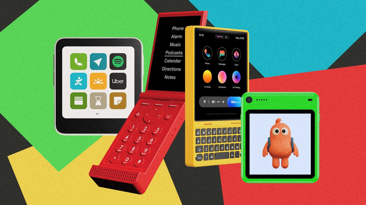
On our video call, Shreyas Narlanka holds up a 3-inch square screen called Meadow. It looks like a thick, equilateral iPhone 13 mini. It would easily fit in my jeans’ front pocket. I instantly wanted one. The Meadow is just one of a small but growing merry band of devices that want to help people cut their hyperdependency on their smartphones. There’s Ikko’s MindOne Pro, a kids’ phone called Freckle, the Light Flip phone, and even an aluminum case called RePod designed to turn obsolete Apple Watches into iPhone-iPod hybrids. These gadgets are coming at an opportune time because every day I hate my iPhone and my Mac a little more. I ache for a compact device that gives me the convenience of digital life that doesn’t take the life out of me. Which explains why I keep dreaming awake about ditching my iPhone only to end up doomscrolling Instagram (the irony!) so I can watch reels that show how people use these new gadgets to stop doomscrolling Instagram. Plenty of others seem to be as tempted as I am. The Hong Kong startup that makes the RePod tells me that it has sold more than 50,000 units since July. Ikko’s MindOne drew 3,411 backers on Kickstarter, who pledged nearly $1.5 million. And Meadow’s first two preorder batches sold out, Narlanka tells me. Its second production run is now underway. I like to believe that, eventually, there will be a flip in the gadget spacetime continuum. One in which a big silent majority of people, fed up with their own toxic digital stupor, decide that it’s time to get rid of the smartphone in favor of a new class of device. I don’t know what the final form of this device will be. Perhaps AI agents will enable something different, hopefully not tied to Google, Apple, or Meta? Maybe. For now, I look at these gadgets and I see promise. Rethinking the user experience Narlanka, 25, dropped out of University of California, San Diego, where he was studying cognitive science focused on human-computer interaction. He sold his previous startup, an e-commerce and inventory management platform built for sneaker and collectable resellers, and decided it was time to craft a phone designed to stop using your phone. He knew that this phone would require a new user experience. Just like the designers at Light, who are betting that “intentional friction” will help a generation quit doomscrolling, notifications, and anxiety-driven app checking, Narlanka and his team knew that the first thing that needed to go was the apps that enslave us to our screens. But that wasn’t enough. “We started with a prototype that was basically a small smartphone, shrunken down like an iPhone mini, but it didn’t feel any different,” Narlanka tells me. Since almost every app on earth is drawn for a tall, skinny rectangle, their brains wanted to do what they were doing before: “We still checked it like a smartphone. We pulled it out and tried to scroll it.” With the Meadow, the objective was to create a useful tool, not another phone. It’s a tool you’re supposed to put away—one that doesn’t sing a promise of endless entertainment, like a mermaid living in your back pocket. “When you put it away, it should feel like it’s really gone until you need it,” Narlanka says. The team went looking for the shape “that made your brain think it was totally different.” The answer, they discovered, had less to do with the shape itself than with what the shape lets you refuse more easily. The square works because it helps our smartphone-trained brains anticipate a new kind of experience. And, as a bonus, it also turned the phone into a conversation starter. “It doesn’t look like an iPod. It doesn’t look like a phone,” Narlanka says. “So people naturally go, ‘Oh, what is that?’” But that was only half of the Meadow equation. If you install an ordinary app into a square window, it turns into a cramped, cropped mess. So the design team decided to offer only a handful of apps that its customers might want on the go. Before Meadow, Light went the same route back in 2015, when the company started to push digital detox with its first “dumb” phone. Built as the anti-Google, anti-Apple, anti-Meta phone, Light’s devices are designed to function as a tool, with apps that enable users to call, consult their calendars, or check for directions with minimalist user interfaces. Instead of building every tool from scratch like Light did, Meadow handpicked a short list of real apps and made them fit into the square format: calls and texts; navigation; Uber and Strava for getting around; Spotify and Apple Music for the ride. There’s also a camera, location sharing, note-taking, memo recording and a way to show a QR code. The first software update also brought in voice dictation, swipe typing, and an optional ringtone. That’s it. There is no browser, no social media, no news feed, no Instagram or TikTok. “When you have an app and you can just freely download any app and you have hundreds on your phone, it makes it a really anxiety-inducing thing,” Narlanka says. “When you’re bored, you’ll naturally go toggle between the apps.” I asked him how it is possible to have square-interface Spotify and Apple Music apps. Meadow didn’t build new apps with those companies, Narlanka explains. Instead, he says, the phone runs the official apps, untouched under the hood. But when it’s time to create the interface, Meadow is able to tweak it thanks to the way Android OS is layered, Narlanka says. “If you go a level deeper into Android, you can actually affect how things are rendered out, how text is laid out [on the screen],” he says. The elements of the UX get carefully rearranged for the square format, he says, without actually changing the official app. It would be impossible to do this UI rearranging for the millions of apps out there but, since Meadow’s design philosophy is reaching a digital anxiety-free nirvana, the company doesn’t have to translate the whole Google Play Store into squares. Just the handful of tools that ship with the phone. One size doesn’t fit all For some people, that will be too limiting. There’s always “one more app” that someone will ask for. That’s why, a few months before unveiling its new Light Flip phone model, Light released a software developer kit. The kit allows third parties to build focused tools like a wallet app to store and show QR boarding passes, which are not built into Light OS. But that app store will be extremely limited and curated. The apps’ UI must fit Light’s UX guidelines, forbidding infinite scrolling, app monetization, and any form of social media. Ikko took another route, showing what happens when users can install anything on a square phone. The company, based in Shenzhen, China, and best known for earbuds, is saturating Instagram with testimonials from users trumpeting its MindOne Pro phone, a slim, card-size Android phone with a nearly square 4.02-inch display and a $500 price tag. It looks very pretty and very well made. Sspai, a Chinese gadget site, says the workmanship “is quite exquisite,” from its tight seams to the feeling of the material. “Holding it in your hand, you can really feel a sense of quality. . . . This almost square body proportion is visually very cute and small. When holding it with one hand, the thumb can almost touch the upper edge and the other side of the screen,” it points out. “It feels wonderfully like holding a smart home panel with excellent texture.” The problem is the apps. The phone stretches everything to fill the square in any way it can, cropping the tops and bottoms of videos and web pages. Even Ikko’s custom phone and messaging apps aren’t well adapted to the screen’s proportions, says Sspai. The Verge’s Allison Johnson writes that “fighting to look at webpages and apps built for rectangles through a square-shaped window is just a losing battle.” The screen is also too big, at least according to Meadow’s philosophy. After choosing the square form, the design team went shopping for a display that matched the sketch. They met with Ikko’s display manufacturer and passed. “It was too big,” Narlanka says. “For us, the size is really important.” Meadow’s rule is that a single thumb has to reach across the whole screen, a principle that Steve Jobs himself pointed out about the original iPhone when it was introduced. “The square [Meadow got] is really satisfying,” he adds. Friction as a feature The main contrast between Ikko and Meadow, however, is the friction both devices introduce and the way they do that. Ikko’s MindOne Pro has lots of friction, but the annoying kind. It feels less like the result of a design philosophy than a byproduct of a poorly thought-out approach. The Meadow introduces the friction on purpose. It is the feature, by design. It is baked into the design, designed throughout the entire UX. On the Meadow, you can text, but there’s no inbox to doomscroll. “To text someone, you have to actually go into the contact and click ‘message,’” Narlanka says, which is “much more intentional than just like, oh, let me see who texted me and let me scroll this thing and refresh it.” On the MindOne Pro, you get a conventional inbox-style messaging app. On the Meadow, there’s no front camera; just a little mirror next to the rear lens for framing selfies. You get one look at each photo to check it’s in focus, then it’s locked away until it syncs over Wi-Fi and you open it somewhere else. “You’re not scrolling your camera roll,” he says. “You’re actually living life.” On the MindOne Pro, the main camera flips around to take the selfie, and offers the same experience as your regular Android photo apps but in a cramped screen. On the Meadow, the square shapes the UX. On the MindOne Pro, the square destroys the UX. My only worry here is that, just like Light opened a door to apps through its albeit limited SDK, it seems that the friction keeps getting sanded down. One example: Texting wasn’t in Meadow’s original plan. The company added it once the team started using it outside the lab and saw how people wanted to be able to receive texts from people outside of their synced contacts. Spin to unspin The search for cures to our digital anxiety doesn’t stop at phone-like devices. Hong Kong-based Techpod had another idea: Repurpose an old strapless Apple Watch to give it a new form factor and functionality using a metal case with a spinning wheel control. Spinning the wheel physically rotates the Watch’s Digital Crown, operating the Watch’s screen. The RePod C1 (starts at $60, plus whatever your watch was) mixes the rounded, elongated form factor of the fourth-generation iPod nano with the physical controls of the original iPod. Kore—Techpod’s founder—tells me that his device is partly for people who “want to stay connected without constantly reaching for a full-size smartphone and getting pulled into messages and social feeds.” Depending on the Watch model and setup, he says, the result can feel like a “mini iPhone.” Put an LTE-enabled Apple Watch inside and you get a mini-iPhone mini. Like Meadow, it’s small enough to hold the essentials and too small to swallow your free time. The RePod’s minimalist design philosophy goes beyond changing the form factor. Recycling a device that otherwise would have died alone in a drawer aligns perfectly with this slow-living philosophy that seems to power the whole digital detox movement. The physical design of the case also aligns with the less digital, more analog part of the philosophy. Techpod tried a Bluetooth version first, “but the experience wasn’t good enough,” Kore says, so they decided to go with “purely physical controls.” It was very hard, he points out. Getting a metal ring to grip and turn a tiny crown without slipping took “extremely tight tolerances,” several manufacturing partners, and a year refining the manufacturing process, he recalls. On top of that, they had to keep those precision levels across seven versions for different Watch sizes. Kore insists RePod isn’t an iPod knockoff, however. “Our tribute is primarily to the wheel-based way of interacting with a device,” he says. But he doesn’t hide his love for the original iPod: “Apple no longer makes the iPod, but the desire for that kind of experience hasn’t disappeared.” His slogan is “Less scrolling, more spinning.” Perhaps the slogan should have been: “Less scrolling, less spinning your wheels. More living your life.” I’m afraid these devices can’t really get us out of the infinite rabbit hole that we got ourselves into. Neither the RePod, the MindOne Pro, nor the Meadow is capable of that. Narlanka himself tells me that the Meadow is not a phone replacement: “It’s just you leave your phone at home and take this when you want to unplug.” But at $448 plus a mandatory T-Mobile plan from $15 to $35 a month (only available in the U.S.) that seems like a pretty big ask. At that price, I want a thingamajig that holds all the keys to all the things we truly need on the go, without the noise, leaving everything else to my MacBook. I have the inkling that, perhaps, the advent of truly effective AI agents will be the key to making this happen. But I digress. Right now, these new-wave devices are making a good case for that dream device. A square that won’t scroll, an app list that won’t grow, and a wheel that won’t let you swipe are a great demonstration that we can do a lot better than our current time-sucking devices. If the worst habits of our phones were designed in, these machines prove that they can be designed out.

Presentation: Panel: Who Builds the Frontend Now? (And What Breaks When They Do) infoq
Nov 04, 2026

Presentation: Panel: Who Builds the Frontend Now? (And What Breaks When They Do)

The panelists explain how AI tools and vibe coding reshape frontend and mobile engineering. They share insights on evolving junior developer roles, managing AI-generated code review fatigue, designing systems for autonomous agents, enforcing architectural guardrails, and navigating economic shifts in open-source software sustainability. By Luca Mezzalira, James Hall, Danielle An, Ivan Zarea

DataGrip and Database Tools User Experience Survey #3 Results Jetbrains.com
Nov 03, 2026

DataGrip and Database Tools User Experience Survey #3 Results

Introduction Hello, DataGrip community! We’re back with the results of our third DataGrip and Database Tools User Experience Survey. A big thank you to everyone who took the time to participate! This year, 1,420 people shared their experiences with DataGrip a…

The Missing Feature Every AI Assistant Needs: Transparent Usage Indicators devto
Nov 03, 2026

The Missing Feature Every AI Assistant Needs: Transparent Usage Indicators

Overview: This article examines why transparent usage indicators should be a fundamental part of modern AI assistants and digital services. Keywords: Artificial intelligence (AI), AI assistants, user experience (UX), user interface (UI), usage limits, usage quotas, usage meters, usage indicators, usage tracking, rate limits, throttling, resource allocation, feature availability, usage transparency, product design, human-computer interaction (HCI), customer experience (CX), user expectations, digital trust, product usability, subscription services, and responsible AI design. The Missing Feature Every AI Assistant Needs: Transparent Usage Indicators Transparent usage indicators should be a standard part of every AI experience. Whether we're generating images, analyzing files, using advanced models, conducting research, or accessing other features, users deserve to know where they stand. A little transparency goes a long way toward building trust in a product. I think there are at least four things AI assistants need to do a much better job of: A visible usage meter: Show users how much of their available usage remains, rather than making them guess. Advance warnings: Notify users when they're approaching a usage limit, not just after they've exceeded it. A clear reset countdown: Tell users exactly when their usage will become available again, preferably before they run into a restriction. Feature-specific usage information: Clearly explain which limits apply to which features, so users understand what they can still do when one limit is reached. AI tools should empower users, not leave them guessing about when their access might suddenly disappear. Can you think of anything else that should be included? Let me know in the comments!

Episode 150 | Usability Backpackinglight.com
Nov 02, 2026

Episode 150 | Usability

How easy is your gear to use when conditions change? Ryan Jordan explores usability in hiking and backpacking gear, from trekking-pole adjustments to an analog watch’s rotating bezel. Learn how physical representation, direct manipulation, and tactile feedbac…

Galaxy Watches could soon get a major UX change with a software update sammobile
Nov 02, 2026

Galaxy Watches could soon get a major UX change with a software update

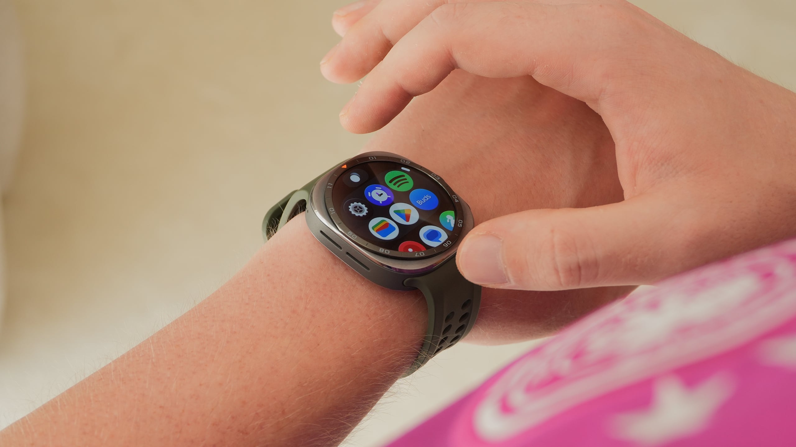
Galaxy Watches run the One UI Watch software, which is based on Wear OS. Most features introduced with newer versions of Wear OS reach Galaxy Watches through One UI Watch updates. Now, a major UI and UX change could be introduced to Galaxy Watches with the next Wear OS update. Google has announced (via 9To5Google) […]

Enlightenment desktop 0.28 released with better networking Omgubuntu.co.uk
Nov 01, 2026

Enlightenment desktop 0.28 released with better networking

Enlightenment 0.28 has been released, the first major update to the open-source desktop environment since early 2025. Given the time between this and the previous 0.27 release, the changelog is suitably lengthy. Networking and audio stack enhancements, UI and…

Home office: 60 vagas para trabalho remoto internacional [01/11] jornal24horas
Nov 01, 2026

Home office: 60 vagas para trabalho remoto internacional [01/11]

Em parceria com a Remotar, o TecMundo apresenta mais uma seleção de vagas remotas para quem quer atuar no mercado internacional e receber em dólar ou euro. Há oportunidades em Marketing, Vendas, Tecnologia da Informação, Dados e muito mais. Confira! Vagas em áreas Administrativa, Marketing e Vendas De modo geral, aqui concentram-se vagas fora da […]

Integrating AI Voice with Notion and Productivity Tools devto
Oct 30, 2026

Integrating AI Voice with Notion and Productivity Tools

Why Voice Matters in Modern Productivity We’ve all been bitten by the “I wish I could just talk through my notes” itch. Whether it’s jotting down ideas, updating a project status, or simply listening to a long‑form document while commuting, voice can turn a tedious task into a fluid, hands‑free experience. When you pair a robust text‑to‑speech (TTS) engine with a productivity platform like Notion, you get a powerful synergy that can boost focus, reduce eye strain, and free up your thumbs for other tasks. The Building Blocks Component What It Does Typical Tech Stack Voice Generation Convert text into natural‑sounding speech TTS APIs (ElevenLabs, Google Cloud TTS, Amazon Polly) Voice Capture Record user input for voice‑to‑text or voice cloning Web Speech API, Whisper, local mic libraries Integration Layer Connect TTS to Notion or other tools REST APIs, Zapier, custom webhooks User Interface Trigger playback, record, or edit voice content Browser extensions, desktop widgets, mobile apps Below, we’ll walk through a minimal, end‑to‑end example: reading a Notion page aloud and creating a voice‑cloned summary that you can embed back into Notion. 1. Pulling Content from Notion Notion’s API returns pages as JSON. The easiest way to fetch a page is via curl or a short Python script. Make sure you’ve created an integration token in Notion and shared the page with that integration. curl -H "Authorization: Bearer $NOTION_TOKEN" \ -H "Notion-Version: 2024-04-15" \ https://api.notion.com/v1/pages/$PAGE_ID import os, requests NOTION_TOKEN = os.getenv("NOTION_TOKEN") PAGE_ID = os.getenv("PAGE_ID") headers = { "Authorization": f"Bearer {NOTION_TOKEN}", "Notion-Version": "2024-04-15", "Content-Type": "application/json", } resp = requests.get(f"https://api.notion.com/v1/pages/{PAGE_ID}", headers=headers) page_content = resp.json() print(page_content["properties"]["title"]["title"][0]["plain_text"]) Extract the main body text (usually under blocks or rich_text) and feed it into your TTS pipeline. 2. Turning Text into Speech with ElevenLabs ElevenLabs offers a high‑quality, developer‑friendly TTS API that supports voice cloning and custom voice models. It’s also one of the most affordable options on the market, making it a perfect fit for hobby projects and early‑stage startups. Quick‑Start Example (Python) import requests, json, os ELEVENLABS_API_KEY = os.getenv("ELEVENLABS_API_KEY") "xi-api-key": ELEVENLABS_API_KEY, # 1️⃣ Choose a voice (the “Rachel” demo voice is great for demos) voice_id = "Rachel" # 2️⃣ Prepare your text text = "Hello, this is a test of the ElevenLabs text‑to‑speech API." # 3️⃣ Call the synthesis endpoint payload = { "text": text, "voice_settings": resp = requests.post(f"https://api.elevenlabs.io/v1/text-to-speech/{voice_id}", headers=headers, data=json.dumps(payload)) # 4️⃣ Save the resulting MP3 with open("output.mp3", "wb") as f: Tip: If you want to clone your own voice, ElevenLabs provides a simple web UI where you can record a short sample (≈ 30 seconds). The platform will generate a custom model that you can use by swapping voice_id for the model’s ID. Using the API via curl curl -X POST "https://api.elevenlabs.io/v1/text-to-speech/Rachel" \ -H "xi-api-key: $ELEVENLABS_API_KEY" \ -H "Content-Type: application/json" \ -d '{"text":"Hello from ElevenLabs!","voice_settings":{"stability":0.75,"similarity_boost":0.8}}' \ --output output.mp3 The resulting output.mp3 can be streamed directly in the browser, or you can upload it back to Notion as an audio file attachment. 3. Embedding the Audio Back into Notion Notion’s API also supports uploading files. After generating the MP3, you can host it on a static server or use a service like AWS S3, then attach the URL to the page. # Assuming you have uploaded output.mp3 to a public URL audio_url = "https://mycdn.com/audio/output.mp3" # Create a file block in Notion "parent": {"page_id": PAGE_ID}, "properties": {}, "children": [ { "object": "block", "type": "file", "file": { "type": "external", "external": {"url": audio_url} ] resp = requests.post("https://api.notion.com/v1/blocks", headers=headers, data=json.dumps(payload)) print(resp.json()) Now anyone opening the page can click the audio block and listen to the TTS output right in Notion. 4. Going Beyond: Voice‑Cloned Summaries One of the most exciting use cases for voice cloning is creating a personal audio summary of a meeting or research article. Here’s a quick outline: Record a short voice sample (30–60 seconds) in the ElevenLabs web UI. Upload the sample to the ElevenLabs API to generate a custom model. Summarize the Notion page (you can use GPT‑4 or any summarization model). Synthesize the summary using the cloned voice. Attach the audio back to Notion. # Step 3: Summarize (pseudo‑code) summary = summarize_text(page_text) # Replace with your favorite summarizer # Step 4: Synthesize with cloned voice payload = {"text": summary, "voice_settings": {"stability": 0.75}} resp = requests.post(f"https://api.elevenlabs.io/v1/text-to-speech/{custom_voice_id}", with open("summary.mp3", "wb") as f: This workflow turns a dense 10‑page research note into a 2‑minute audio briefing that you can replay on a walk, while driving, or during a quick break. 5. Handling Latency and UX If you’re building a real‑time voice assistant, consider the following: Pre‑fetch and cache TTS results for frequently accessed pages. Use WebSocket or Server‑Sent Events to stream audio chunks as they’re generated, giving the user a sense of instant playback. Provide a “pause” button that toggles the audio stream, especially useful when you’re reading long documents. 6. Security & Privacy Voice data is sensitive. Always: Store voice samples and generated audio in encrypted buckets. Delete raw voice samples after cloning is complete (ElevenLabs offers a “delete” endpoint). Comply with GDPR/CCPA by providing users the ability to revoke access to their voice model. 7. Integrating with Other Productivity Tools The same pattern applies to tools like Todoist, Slack, or Google Docs: Tool API Endpoint Typical Use‑Case Todoist /tasks Read tasks aloud or clone user voice to read task descriptions Slack chat.postMessage Send a voice‑cloned message to a channel Google Docs docs.batchUpdate Insert an audio file into a doc Because the ElevenLabs API is agnostic to the source of the text, you can build a single microservice that powers multiple integrations. 8. Wrap‑Up & Next Steps Get started: Sign up for ElevenLabs with our affiliate link (you’ll get a free credit to experiment). Explore: Try cloning your own voice or experimenting with different voice settings (stability, similarity boost). Build: Hook the API into your favorite productivity tool and watch your workflow become a little more conversational. Try ElevenLabs Today Ready to bring your notes to life? Click the link below, sign up, and start generating natural‑sounding audio for Notion and beyond. Don’t forget to explore the voice‑cloning feature – it’s a game‑changer for personalized productivity. https://try.elevenlabs.io/kr07zfuqn1bp Happy coding, and may your voice never be silenced again!

We Reviewed 146 AI Design Tools. These 9 Made the Cut. Crazyegg.com
Oct 29, 2026

We Reviewed 146 AI Design Tools. These 9 Made the Cut.

The best AI design tools are rarely the ones with the flashiest demos. We reviewed 146 AI design tools across 32 real-world graphic and web... The post We Reviewed 146 AI Design Tools. These 9 Made the Cut. appeared first on The Daily Egg.

EclipseSource Is Not About the Eclipse IDE Eclipsesource.com
Oct 29, 2026

EclipseSource Is Not About the Eclipse IDE

We are called EclipseSource. We have deep roots in the Eclipse ecosystem, have contributed to Eclipse projects for more than two decades, and are still heavily involved in many projects at the Eclipse …The post EclipseSource Is Not About the Eclipse IDE appea…

180heartbeats + Jung v Matt Designs Creator Experience for CD PROJEKT RED. The agency developed the UX and UI for the new Creators & Ambassadors Program platform roastbrief_us
Oct 29, 2026

180heartbeats + Jung v Matt Designs Creator Experience for CD PROJEKT RED. The agency developed the UX and UI for the new Creators & Ambassadors Program platform

180heartbeats + Jung v Matt has designed the UX and UI for CD PROJEKT RED´s new Creators & Ambassadors Program platform. The initiative is aimed at creators and ambassadors producing content inspired by the Warsaw-based game studio´s titles. The platform is designed to strengthen relationships with communities built around some of the studio´s most popular franchises, including The Witcher […] The post 180heartbeats + Jung v Matt Designs Creator Experience for CD PROJEKT RED. The agency developed the UX and UI for the new Creators & Ambassadors Program platform appeared first on Roastbrief US.

With a cracking new tactical feature and dedicated UI "strike team", Football Manager 27 is a huge step back towards FM's best form eurogamer
Oct 29, 2026

With a cracking new tactical feature and dedicated UI "strike team", Football Manager 27 is a huge step back towards FM's best form

Welcome back, Football Manager. I've only played half a day or so of it, whistling through my inductions, board meetings and opening transfer window, but already the positive signs are there. Football Manager 27 is a big, much-appreciated step in the right direction. In a way it's a step back - this is essentially the game I wish FM26 had been - but sometimes that's necessary. One back, two forward. At least it's genuine progress. This is a Football Manager game again.

MacBook Pro with Touch: A Mac for the iPad Generation MacStories
Oct 28, 2026

MacBook Pro with Touch: A Mac for the iPad Generation

Ever since I got my hands on the very first iPad Pro all the way back in November 2015, I’ve gotten used to a certain type of computer interaction that Steve Jobs once decried as “ergonomically terrible”: working with a keyboard, but sometimes also touching t…

Apple Unveils OLED‑Powered MacBook Pro Lineup, Setting New Standards for Performance and Design headtopics
Oct 28, 2026

Apple Unveils OLED‑Powered MacBook Pro Lineup, Setting New Standards for Performance and Design

"Over the past five years Apple positioned the MacBook Pro as a modest refresh machine, but the latest models break from tradition with an OLED display, a lighter chassis, and a sophisticated UI overhaul. The 14‑inch and 16‑inch variants launch at $2,899 and $3,399 respectively, while the premium M5 Max models can exceed $10,000. Apple's move to integrate a touch‑enabled screen, Dynamic Island, and Spotlight into the macOS experience signals a bold shift in its product philosophy."

Tools UI UX Designer Should be Using geeksforgeeks
Oct 28, 2026

Tools UI UX Designer Should be Using

UI/UX design tools help designers create interface layouts, build interactive prototypes, organize research, and collaborate with teams. Different tools support different stages of the design process, from brainstorming to motion design and project documentation. Design tools support wireframing, interface design, and prototyping. Collaboration tools help teams share ideas, feedback, and project information. Tool

Article: Building an Offline-First AI Coding Tutor for Low-End Android Phones infoq
Oct 28, 2026

Article: Building an Offline-First AI Coding Tutor for Low-End Android Phones

This article is about engineering an offline-first app for low-end devices based on our experience in Nigeria and India. The interesting problems in this space are storage, quota, cold start, and failure-path design. Our approach applies to any product whose users are on constrained devices and intermittent connections, when the assumption they have a laptop and broadband access do not hold. By Chidi Nwaogu

Basic Web Concepts geeksforgeeks
Oct 28, 2026

Basic Web Concepts

Before starting web development, beginners should understand a few basic concepts that help them build functional, accessible, and user-friendly websites. Web ConceptsResponsive Design means it adapts website layouts to different screen sizes using flexible layouts, images, and CSS media queries. Static Websites display predefined content and are suitable for portfolios, landing

calhacks 13 devto
Oct 27, 2026

calhacks 13

What I Built Statheros is a macOS drawing companion for Krita that lets you draw with your head, your palm, or your voice instead of a mouse or stylus. It’s built for artists who find fine motor control hard: people with tremors, limited hand mobility, or fatigue that makes holding a pen painful. It runs as a small floating panel next to Krita and does four things: Camera tracking. MediaPipe face or hand landmarks run locally and map onto a cursor across your display. A five-point calibration (neutral, left, right, up, down) fits the range to how you move, not how a “typical” user moves. It even notices when your camera’s axis is flipped and offers a one-click fix. A safe drawing area. Statheros reads Krita’s window through macOS Accessibility (no screen recording, no Krita plugin) to find the canvas, and it only presses the pen inside that rectangle. If it can’t identify the canvas, you drag one out with the mouse. The panel and Camera Preview are always excluded, so you can’t scribble over your own controls. Stroke assistance. You can pick a stroke mode: Natural, Precision, Sketch, or Tremor Filter, which smooths small unwanted oscillations while keeping the stroke you meant. There’s also a “hold still to lift” gesture: once you’ve moved more than 15 points, holding within 7.5 points for 1.2 seconds lifts the pen. Voice commands. Say “pen down”, “eraser”, “undo three times”, “swap colors”, or just “I want to rub that out”, and it happens in Krita. What inspired it: drawing tools assume steady hands. Krita’s stabilizer helps once the pen is on the canvas, but it doesn’t help you get the pen there, switch tools, or undo a mistake without reaching for a keyboard. We wanted to remove every step of “pick up the stylus” from the workflow. What I learned: Safety beats features. The app starts paused, with camera and mic off and fake input on. Real input is a separate opt-in, and nothing resumes on its own after tracking loss. When software moves someone’s cursor for them, the default has to be “do nothing”. macOS permissions are a minefield. Ad-hoc signed builds change identity on every rebuild, so macOS silently drops Accessibility, Camera, and Microphone grants even though System Settings still shows them enabled. We fixed it with a stable local signing certificate, after a lot of confusion. Software you don’t control will lie by omission. Krita doesn’t report whether erase mode is on, so Statheros tracks what it last sent, and “toggle erase” is there to resync. Latency is a feature. That’s why the voice pipeline is split between local and cloud (more on that below). Demo https://www.youtube.com/watch?v=aDrJBGP-vro Here’s the full loop: Open Krita and click Set canvas. Statheros finds the drawing viewport and outlines it. Start the camera and calibrate. Five two-second captures map your range of motion. Turn on Voice Commands and say “pen down”. The pen arms, then presses as soon as the cursor enters the canvas. Draw with your head or palm, with Tremor Filter smoothing the line. “Undo twice, then switch to the brush.” Both steps happen, in order. Partner Technologies Cartesia: real-time speech-to-text Voice was the hardest part to get right. Someone who can’t easily reach a keyboard needs commands to feel instant, but they also need to talk naturally, not memorize a vocabulary. We ended up with a two-tier pipeline: On-device command words. sherpa-onnx keyword spotting plus Silero VAD runs on a worker thread and listens for Statheros’s fixed command words (“pen down”, “eraser”, “undo”, “bigger”, “tremor filter”, “pause”, and so on). When one is spotted, it runs immediately, even mid-sentence (“switch to the brush”), and that audio never leaves the Mac. Cartesia Ink for everything else. If an utterance ends without a command word, we stream it to Cartesia’s ink-2 model over WebSocket using the Auto endpoint. A red cloud dot shows on the panel whenever audio is being sent, so you always know when you’re being heard by a server. ⌘⇧Space push-to-talk uses Cartesia’s Manual endpoint for one utterance at a time. Implementation notes: We stream only from the start of the current utterance, never earlier, so a command word that already ran locally doesn’t get transcribed and run a second time. Utterances under 250 ms are ignored, and if more than two seconds of audio backs up on a connection, the utterance fails rather than running a stale command late. Integration tests run the real VAD and keyword pipeline on WAV fixtures against a local fake Cartesia WebSocket server, including a 401-on-connect case, so we could test failure paths without burning API credits. What it was like: Ink’s streaming latency was low enough that the cloud path feels natural for conversational requests. Our first design used a “hey cartesia” wake phrase. In practice it was clumsy to say over and over, so we replaced it with open mic plus local command words. That turned out to be both faster and more private. Anthropic Claude: understanding what you meant A transcript isn’t an action. “I want to rub that out” should turn on the eraser. “Don’t undo” should not undo. And “undo a few times” needs a number. Every transcript becomes an ordered plan of actions with repeat counts. Plain phrasings (“undo 3 times”, “undo twice then switch to the brush”) are parsed locally and run immediately. Anything else goes to Claude Haiku, which has to answer using only Statheros’s own action set. It can’t invent commands. That gave us: Natural-language mapping: “get rid of that last line” → undo. Negation safety: if the local parser hears a negation, it won’t guess. It defers to Claude, or does nothing if no Anthropic key is configured. Ignoring non-requests: with an open mic, you’ll talk to people in the room. Claude classifies those as “not a request”, and Statheros ignores them silently, with no error toast. Bounded repeats: only undo, redo, bigger, and smaller can repeat, at most 20 times, about 60 ms apart. Only the transcript is sent to Claude, never audio. Command words spotted on-device never call it at all. The API key lives in the macOS Keychain. Also used MediaPipe Tasks Vision for face and hand landmarks, running locally in a worker Electron + React for the panel, and a Swift native helper for Accessibility canvas detection and synthetic pen input Hackathon Experience Cal Hacks 13.0, October at the Palace of Fine Arts FREE YUMMY MATCHA EVERYDAY PROVIDED BY GREPTILE!!! I built Statheros with Issac and Jedric. I met Issac from a previous hackathon at Dddoski and I met Jedric from my partner's mutual friend. Issac brought in the original “Steady” tracking app, and I built the Cartesia voice input, the Figma design integration, and the Claude intent layer. Jedric had worked on the UI UX design on Figma! The moment “I want to rub that out” first turned on the eraser by itself, or the first time someone drew a line without touching anything was what I remembered the most. What’s next: I want to start testing with artists who have tremors, incorporate more Krita commands, and work with other drawing apps!

User Experience Design for Kids: Why Children Should Learn to Design Technology for Other People devto
Oct 27, 2026

User Experience Design for Kids: Why Children Should Learn to Design Technology for Other People

A child opens a new app and immediately knows which button to press. Another app leaves them searching through menus, tapping unfamiliar icons and wondering what to do next. Both applications might perform similar functions. So why does one feel effortless while the other feels confusing? The answer often comes down to how the experience has been designed. Children regularly interact with websites, games and digital applications, yet they rarely stop to consider the decisions behind these experiences. Introducing user experience design for kids offers an opportunity to explore technology from an entirely different perspective. Instead of simply asking what an application can do, children begin asking who will use it, what those users need and how the experience could be improved. This shift encourages creativity, observation and thoughtful problem-solving without requiring advanced programming knowledge. What Is User Experience Design for Kids? User experience design, commonly called UX design, focuses on how people interact with products, services and digital systems. In technology, it involves making websites, applications and other digital experiences understandable, accessible and useful. For children, the concept can be introduced through a simple question: "How would someone else experience what I have created?" Consider a student designing a digital invitation for a school event. The invitation may look attractive, with colourful illustrations and creative fonts. However, if the date is difficult to find or the location is missing, the design does not fully serve its purpose. A child exploring UX design learns to consider both appearance and functionality. The aim is not to teach professional design software immediately. It is to help students recognise that successful design begins with understanding the people who will use it. Why Good Design Requires More Than Creativity Children are frequently encouraged to express their imagination through drawing, storytelling and digital creation. These activities are valuable, but design introduces an additional consideration: practical usefulness. A visually interesting creation may still be difficult for another person to understand. For example, imagine a teenager designing the homepage for a school club. They include animated graphics, colourful buttons and photographs. The page looks impressive, but visitors cannot easily find the club's meeting schedule. The design challenge is not necessarily to add more features. It may be to simplify the page, improve navigation or make essential information more visible. Learning to Balance Appearance and Function This distinction encourages students to evaluate their decisions rather than relying entirely on personal preferences. A child might love a particular colour combination, but discover that the text becomes difficult to read against the background. They may enjoy unusual navigation icons, but realise that first-time visitors cannot understand them. Such observations introduce an important principle of human-centered design: a design should be evaluated partly by how well it supports its intended users. How User Experience Design for Kids Develops Empathy One of the most interesting aspects of UX education is its connection to understanding other people's perspectives. Children naturally approach activities through their own experiences. Designing for another person requires them to consider needs, abilities and preferences that may differ from their own. Designing for Different Users Imagine asking students to design a simple digital library catalogue. A younger child might need large, recognisable icons and straightforward navigation. A teenager may prefer search filters that help locate books by genre or author. A teacher might need quick access to information about available copies. The same digital product serves different people, each with distinct needs. Children can explore these differences by creating fictional user profiles or speaking with potential users, with suitable adult supervision. They can then discuss how their design choices might change. Importantly, empathy in design does not mean assuming what someone needs. It also involves asking questions, listening to feedback and being willing to reconsider initial ideas. Teaching Children to Notice Everyday Design Problems Children do not need sophisticated tools to begin learning UX principles. Many useful design lessons can emerge from familiar experiences. A confusing television remote, an unclear instruction sheet or a poorly organised school noticeboard can all provide opportunities for discussion. Ask a child to identify something that is difficult to use. Then encourage them to consider why the difficulty occurs. Are the instructions unclear? Are important details missing? Does the product require too many steps? A Simple Redesign Activity Choose a familiar application screen or a fictional school website. Ask the child to sketch a redesigned version on paper. They might rearrange buttons, simplify menus or make important information easier to locate. Next, invite another family member to examine the sketch and explain what they would do first. If the intended action is unclear, the child can revise the design. This introduces a basic UX process: observe a problem, propose a solution, test it and refine the result. The emphasis should remain on understanding the experience rather than producing a perfectly polished design. The Connection Between UX Design and Coding Education User experience design and programming address different parts of digital creation. Programming focuses on instructions and functionality that enable software to work. UX design considers how people understand and interact with that functionality. A student building a basic website might successfully create a working navigation menu. However, they must also consider whether visitors can find the information they need. Similarly, a functional quiz application may become more approachable when its instructions are clear and its feedback helps users understand what happened. This is where coding and design can complement one another. Children who explore both areas can begin to connect technical decisions with the experience of using the resulting product. Platforms such as CodingZen, which offer web development and coding education for kids, provide opportunities to explore the technical foundations of digital creation. UX principles can add another dimension to such learning by encouraging students to consider usability alongside functionality. Neither skill replaces the other. Together, they offer different perspectives on how digital products are created. Why Accessibility Belongs in Children's Design Education An essential part of thoughtful design is recognising that people interact with technology in different ways. Some users may have difficulty reading small text. Others may rely on keyboards rather than touchscreens or mice. Certain colour combinations can also make information difficult to distinguish. Children can explore accessibility through practical questions. Would an important button remain understandable without its colour? Is the text large enough to read comfortably? Can someone identify the purpose of an icon without guessing? These discussions introduce the idea that accessibility should be considered during the design process rather than treated only as a final adjustment. They also help children understand why designing for personal preference alone may overlook other users. Helping Children Accept Feedback on Creative Work Creative activities often involve a strong sense of ownership. A child may spend considerable time developing an idea and feel disappointed when someone struggles to use it. UX design offers a constructive way to approach that experience. Instead of interpreting feedback as criticism of the creator, students can learn to view it as information about the design. If someone cannot locate a button, that observation provides an opportunity for improvement. Parents can support this process by asking questions such as: "What did the person expect to happen?" "Which part was confusing?" "What could you change to make the next attempt easier?" These conversations encourage revision without demanding perfection. They also reinforce the idea that a creator's intentions and a user's actual experience may not always match. Conclusion: Teaching Children to Think Beyond Their Own Screens Children experience the results of design decisions every time they use a website, application or digital device. Learning to recognise those decisions gives them a more thoughtful understanding of technology. Introducing user experience design for kids encourages children to consider the people behind every interaction. It brings together creativity, observation, empathy and practical problem-solving in ways that extend beyond programming. Most importantly, it introduces a valuable question that can guide many forms of creation: "Does this make sense to the person who will use it?" Learning to ask that question may be one of the most meaningful starting points for designing technology with purpose. Frequently Asked Questions 1. What is user experience design for kids? User experience design for kids introduces children to the process of making websites, applications and digital products easier to understand and use. It focuses on recognising user needs, organising information, improving navigation and testing design ideas. 2. Can children learn UX design without knowing how to code? Yes. Children can begin learning UX design through observation, drawing, paper prototypes and simple redesign activities. Programming becomes useful when students want to turn their design ideas into functioning digital products. 3. What is the difference between UX design and UI design? UX design focuses on the overall experience of using a product, including how easily people can complete tasks. UI design, or user interface design, focuses on the visual and interactive elements people use, such as buttons, menus, layouts and icons. 4. How can parents teach design thinking to children at home? Parents can ask children to identify a frustrating everyday experience and suggest ways to improve it. Drawing alternative layouts, testing instructions with family members and discussing user feedback are approachable ways to introduce design thinking. 5. How does learning UX design complement coding education? Coding helps students understand how digital products function, while UX design encourages them to consider how people interact with those products. Exploring both can help children connect technical creation with usability, communication and thoughtful design decisions.

AI agents for embedded design eenewseurope
Oct 27, 2026

AI agents for embedded design

AI agents are all the rage, and the technology is being integrated into embedded development environments to boost productivity. AI can be used for code generation and configuration of platforms, and even for the design of hardware in FPGAs, but there are issues with the quality and the safety of code that is produced. “Natural […] The post AI agents for embedded design appeared first on eeNews Europe.

Divisha Jain Knowyourmeme.com
Oct 26, 2026

Divisha Jain

Choosing an iOS app development company is a high stakes decision. The right partner ships a polished app that passes App Store review, protects user data,

Mobile App Development Practices geeksforgeeks
Oct 26, 2026

Mobile App Development Practices

Mobile app development involves more than writing code and designing screens. Building a reliable application requires careful planning, user-focused design, secure architecture, performance optimization, and continuous testing. Following established development practices helps businesses create applications that meet user needs and remain maintainable as requirements evolve. Plan application requirements and choose an

IDFC FIRST Bank Q2 FY27 Results: PAT up 196.5% YoY at 1,045 Crore philippinetimes
Oct 26, 2026

IDFC FIRST Bank Q2 FY27 Results: PAT up 196.5% YoY at 1,045 Crore

VMPL Mumbai (Maharashtra) [India], October 26: IDFC FIRST Bank today announced its unaudited financial results for the quarter and half year ended 30 September 2026. The Bank reported Profit After Tax of 1,045 crore in Q2 FY27, up 196.5% year-on-year. For H1 FY27, Profit After Tax stood at 2,120 crore, with Return on Assets at 0.99%. Management Commentary 1. Strong deposit growth:

Trading Platform Development: Case Studies Compared techbullion
Oct 26, 2026

Trading Platform Development: Case Studies Compared

Every trading platform developer says it can handle real-time data, order routing, and compliance. But a services page won’t show you whether a team has actually done it. A shipped product will. So this comparison looks at five trading platform development companies through their real case… Read the full article on TechBullion.

IDFC FIRST Bank Q2 FY27 Results: PAT up 196.5% YoY at ₹ 1,045 Crore aninews
Oct 26, 2026

IDFC FIRST Bank Q2 FY27 Results: PAT up 196.5% YoY at ₹ 1,045 Crore

Mumbai (Maharashtra) [India], October 26: IDFC FIRST Bank today announced its unaudited financial results for the quarter and half year ended 30 September 2026. The Bank reported Profit After Tax of ₹1,045 crore in Q2 FY27, up 196.5% year-on-year. For H1 FY27, Profit After Tax stood at ₹2,120 crore, with Return on Assets at 0.99%.

From Human Intent to AI agent Behavior: Yanice Yang’s Approach to Generative AI techbullion
Oct 24, 2026

From Human Intent to AI agent Behavior: Yanice Yang’s Approach to Generative AI

The AI product designer and human-computer interaction (HCI) researcher combines research in diffusion-based interface generation, agent behavior design and controlled model testing to advance human-centered AI design. Ask an AI tool to change a headline, and the next version may also rearrange the… Read the full article on TechBullion.

SAP UX Q3/2026 Update – Part 5: SAP Concur blogs_sap
Oct 24, 2026

SAP UX Q3/2026 Update – Part 5: SAP Concur

This fifth post in my series gives an overview of latest UX innovations in SAP Concur, for managing your travel and expense. The Joule Meeting Planning Agent is now even more powerful, able to flag big events taking place at locations which might spike hotel prices as well enabling you to block hote...

50+ Award-Winning Website Designs with Creative UI/UX Graphicdesignjunction.com
Oct 23, 2026

50+ Award-Winning Website Designs with Creative UI/UX

Great website design is about more than attractive colors and beautiful images. The best websites combine creative layouts, readable typography, smooth interactions, and simple navigation to create a better experience for visitors. From agency portfolios to o…

UX Disciplines: Glossary Nngroup.com
Oct 23, 2026

UX Disciplines: Glossary

Definitions of fields related to user experience, including UX design, UI design, visual design, interaction design, service design, UX research, and DesignOps

Salesforce Email Login Is the New Default: Convenience or Security Risk? salesforceben
Oct 23, 2026

Salesforce Email Login Is the New Default: Convenience or Security Risk?

If you use login.salesforce.com or test.salesforce.com to get into your orgs and are using your username to log in, Salesforce sent out an email in September stating that they will be making email the default login option instead, with production orgs entering the rollout window this October. This email login experience was released last year, […] The post Salesforce Email Login Is the New Default: Convenience or Security Risk? appeared first on Salesforce Ben.

Infragistics to Strengthen Blazor Development with Microsoft manilatimes
Oct 22, 2026

Infragistics to Strengthen Blazor Development with Microsoft

Infragistics Expands Its Open-Source Commitment with Direct Contributions to Blazor and the Broader .NET Community Enterprise UI for Every Blazor App Financial Portfolio - Asset tracking and profit-and-loss analysis with interactive dynamic charts. Cranbury, NJ, Oct. 22, 2026 (GLOBE NEWSWIRE) -- Infragistics, the global software company behind the UI and UX solutions powering applications for the world’s largest enterprises and software developers, announced its work with Microsoft to advance Blazor. As the .NET ecosystem and its global developer community continue to grow, Infragistics is bringing its nearly four decades of experience building enterprise-ready UX and UI solutions for Morgan Stanley, Société Générale, Infosys, Canon and more, directly into Blazor’s continued evolution. Through the collaboration, Infragistics will add new features, address bugs and contribute directly to Blazor and the broader Microsoft .NET ecosystem. Infragistics’ work with Microsoft builds on its growing investment in open-source development and the Blazor community. In late 2025, Infragistics made 50 of its Ignite UI controls open source across Blazor for the first time, anchored by a free, open-source data grid backed by decades of enterprise data grid expertise. The release also includes UI components like Grid Lite, Combo Box, Tile Manager, Tree, Stepper and more. Available without a commercial license, the controls give developers greater flexibility to build, customize and extend modern Blazor applications while contributing to publicly visible code. Those controls sit within the broaderIgnite UI for Blazor library, which includes the full set of Data Grids, Dock Manager and charts in addition to the open-source components. Infragistics’ open-source commitment is now extending directly into Blazor itself. Infragistics has dedicated engineering resources primarily to .NET 11 development in Blazor, with engineers contributing feature enhancements and bug fixes. Those contributions become part of the framework, extending Infragistics’ impact to improve the Blazor experience for the broader Blazor community. Infragistics is also open sourcing its MIT-licensed Blazor wrapper for ApexCharts, one of the world’s most widely used JavaScript charting libraries with more than 1.5 million weekly NPM installs. The wrapper gives Blazor developers a native C# API for building 17 chart types, making ApexCharts easier for .NET developers to use within Blazor applications. Infragistics has brought its Blazor products and components through Microsoft’s own compliance process for security and accessibility, to meet the same standards Microsoft holds for its own frameworks. Ignite UI will now be surfaced through Visual Studio scaffolder and project templates, bringing Infragistics components more directly into the workflow developers use to start new Blazor applications. Withmore than 7 million .NET developers using the Visual Studio family of products each month, the integration expands how easily developers can discover and access Ignite UI. "Microsoft has built one of the most important developer ecosystems, and this collaboration gives us the opportunity to contribute directly to the framework many of our customers and the broader .NET community rely on every day,” said Jason Beres, COO at Infragistics. "By contributing engineering resources directly to Blazor, we’re helping shape the framework’s continued evolution and improve the experience for developers building on .NET.” "The .NET ecosystem is strongest when companies that build for developers also contribute back to the frameworks developers rely on every day,” said Daniel Roth, Principal Product Manager, ASP.NET, Microsoft. "Infragistics brings nearly four decades of experience building enterprise UI and developer tools, and its engineers are now contributing directly to Blazor as we continue improving the developer experience for the .NET community.” Additional information on the Infragistics and Microsoft collaboration can be found here. ### About Ignite UI Ignite UI is a powerful UI toolkit designed to supercharge web application development. With a rich library of high-performance, enterprise-grade components for Angular, Blazor, Web Components, React, and jQuery, Ignite UI delivers everything you need to build modern, data-intensive applications. From the fastest data grids and real-time charts to the DockManager for desktop-like layout experiences, every component is built for speed, scalability, and flexibility. Paired with the intuitive WYSIWYG low-code App Builder™ tool, you can design and deploy stunning apps up to 80% faster-without compromising performance or usability. About Infragistics Infragistics provides the world’s largest enterprises with tools and solutions to accelerate application design and development and foster team collaboration. Over two million developers worldwide use Infragistics’ enterprise-ready UX and UI toolkits to rapidly prototype and build high-performing applications for the cloud, web, mobile and desktop. Reveal is an award-winning developer-first embedded BI platform for ISVs and software teams needing scalable analytics with no user or data limits. App Builder™ is a low code platform that accelerates app development by streamlining the design to code process, delivering production-ready, enterprise-grade code for Angular, Blazor, Web Components and React frameworks. Slingshot is an AI-powered work management platform that simplifies business analytics to enable companies to make more informed decisions, faster. Infragistics clients include Morgan Stanley, Société Générale, Infosys, Canon and other global software providers who rely on Infragistics when reliability and performance are non-negotiable. Attachment CONTACT: Beth Brody Infragistics 908-295-0600 [email protected]

Resume vs Portfolio: What Graphic Designers Need Graphicdesignjunction.com
Oct 21, 2026

Resume vs Portfolio: What Graphic Designers Need

Graphic designers need more than good design skills to get hired. They also need a resume that explains their experience and a portfolio that shows the quality of their work. Both are important, but they serve different purposes. The post Resume vs Portfolio…

UX Designer Skills for Product Design geeksforgeeks
Oct 21, 2026

UX Designer Skills for Product Design

User experience (UX) design focuses on making products useful, accessible, and easy to navigate. UX designers combine research, problem-solving, design methods, and collaboration to understand user needs and improve digital experiences. Skills for UX DesignersUX designers need a combination of research, design, technical, and interpersonal skills. The following skills help them

UI/UX Design Terms and Definitions geeksforgeeks
Oct 21, 2026

UI/UX Design Terms and Definitions

UI/UX design terminology describes the concepts, methods, and metrics used to create and evaluate digital products. Understanding these terms helps designers communicate clearly and make informed design decisions. User Interface (UI) Design focuses on the visual and interactive elements of a digital product, including buttons, typography, colors, and layouts. User Experience (UX)

Top 20 Design Systems For UI/UX geeksforgeeks
Oct 21, 2026

Top 20 Design Systems For UI/UX

Design systems are like a documentary of designs for the designers. In today's fast-paced era, creating exceptional user experiences is paramount. That's where UI/UX Design Systems come into play. From fostering consistency and scalability to enhancing collaboration and efficiency, a well-crafted UI/UX Design System enables designers and developers to streamline

How London start-ups can improve customer experience through UX design londonlovesbusiness
Oct 21, 2026

How London start-ups can improve customer experience through UX design

Early-stage start-ups across London’s competitive tech scene frequently pour initial venture capital into aggressive customer acquisition and feature velocity, often neglecting foundational interface usability. Saturated markets penalise friction-heavy onboarding and… The post How London start-ups can improve customer experience through UX design appeared first on London Business News | Londonlovesbusiness.com.

SAP Cloud ERP Private 2025 FPS1 Release Highlights blogs_sap
Oct 21, 2026

SAP Cloud ERP Private 2025 FPS1 Release Highlights

Hello and Welcome back to the SAP Cloud ERP Private 2025 FPS1 Product Release Highlights! I'm Harish Mangtani from Product Experience at SAP SE. After the fantastic response to our FPS0 highlights, I am thrilled to continue sharing a hands-on view of the newest innovations delivered in this FPS1 rel...

Recombee in 2020: New Features and Improvements recombee
Oct 21, 2026

Recombee in 2020: New Features and Improvements

We know that this year has been quite challenging for many people, including ourselves. However, today we want to focus entirely on the positive (no pun included) side of the year and the stuff we are the proudest of.

Simbari website Fontsinuse.com
Oct 20, 2026

Simbari website

Contributed by Marianna RossiSource: simbariavvocati.it License: All Rights Reserved. We developed a full website redesign for Simbari Avvocati, a Milan-based law firm. From corporate criminal risk to internal investigations: expertise and methodology. Simba…

How to Choose the Best Web Design Agency for Your Business techbullion
Oct 20, 2026

How to Choose the Best Web Design Agency for Your Business

Your website is often the first conversation a customer has with your brand. Choosing the wrong partner means wasted budget, slow pages, and a site that looks fine but brings no leads. Choosing well means a site that ranks, loads fast, and converts. This guide explains how to find the best web… Read the full article on TechBullion.

Why design and user experience are becoming an advantage for banks and fintechs consultancy_me
Oct 20, 2026

Why design and user experience are becoming an advantage for banks and fintechs

As digital financial services expand across the GCC, banks and fintechs face the challenge of turning technology investments into lasting customer and business value. Ghady Rayess, Managing Director at FOO, explores how strategic UI/UX design can improve adoption, strengthen competitiveness and maximise the long-term returns on digital transformation.

Pypi.org
Oct 19, 2026

nouc-studio added to PyPI

Nouc Studio: Self-evolving multi-agent system using Marimo & Monty sandboxes to build auditable, explainable, multi-view Marimo Studio applications from multimodal inputs.

Controversial Adobe clones prove desktop Googlebook apps are closer than I thought chromeunboxed
Oct 19, 2026

Controversial Adobe clones prove desktop Googlebook apps are closer than I thought

If you have spent any time following tech news or developer forums over the past couple of weeks, you have likely run into the massive controversy surrounding ArtCraft. Created by developer Brandon Thomas, the project set out to create a clean-room, open-source reimplementation of virtually all of Adobe Creative Cloud and Microsoft Office: spanning 13 […]

Apps Built with Flutter Framework geeksforgeeks
Oct 19, 2026

Apps Built with Flutter Framework

Flutter is Google's open-source UI toolkit that enables developers to build applications for Android, iOS, web, and desktop platforms using a shared codebase. Its customizable widgets, Hot Reload feature, and efficient rendering make it a popular choice for cross-platform application development. Cross-Platform Development: Build applications for multiple platforms while reusing much

Future of Web Design geeksforgeeks
Oct 19, 2026

Future of Web Design

Web design is the process of planning and creating a website's layout, visual appearance, and interactive elements. It combines design principles with usability and accessibility to create websites that are visually appealing and easy to navigate. Key elements include layout, colour schemes, typography, user interface (UI), and user experience (UX).Latest

Business AI in ABAP Cloud - Embedding AI with the ABAP AI SDK (Part 2) blogs_sap
Oct 19, 2026

Business AI in ABAP Cloud - Embedding AI with the ABAP AI SDK (Part 2)

Business AI in ABAP Cloud - Embedding AI with the ABAP AI SDK (Part 2) Cheers ABAP Folks! In my last blog post, we discussed the high-level strategy for implementing business AI capabilities in ABAP Cloud. We looked at the two pillars, Embedded AI in ABAP and Agentic AI via Joule, and when to use wh...

5.0: A closer look blog_joinmastodon_org
Oct 19, 2026

5.0: A closer look

October is here, and it’s almost time for Mastodon’s 5.0 release! We announced our plans for big changes in an early preview back in August. In this companion article, we’re hoping to shed light on some of the decisions behind this major UI overhaul. Between the feedback we’ve gathered during Discovery Week, an event in which we spent a week doing surveys and workshop sessions with volunteers from the community, and Mastodon’s 10th anniversary coming up, we were determined to deliver something notable. What we were facing Invisible binds Working on Mastodon’s engineering team can sometimes feel like harvesting wheat one stalk at a time. We make a lot happen with limited resources–far more limited than most people realise–but there’s always more to do. There’s more tech and UX debt than is obvious to the naked eye, so something that seems simple on the outside may be often limited by backend constraints or architecture shifts that can’t easily be changed. So we had to make concessions about what we could realistically fit into our 5.0 plans, and leave some work for later. Competing needs What’s better for one person can be worse for another, and we’ve had to keep that in mind throughout the redesign. We’re acutely aware that such a divide is most pronounced between longstanding users and newcomers. Mastodon’s current UI is beloved by many longtime users, since it can be very powerful once you’ve learned its secrets and quirks. However, newcomers should be able to dive in without being overwhelmed. To keep the community fresh, alive and diverse, we need to break down the barriers to joining, so when you bring your friends, they can find their way around without a manual. What we believe in The redesign was grounded in these principles: Clarity trumps convenience. The most powerful interface can be useless if it’s too difficult to figure out. Making things more clear and obvious can result in more friction, and that can be necessary. Leave room for what’s to come. Navigation may feel emptier for now, and that is on purpose. We have lots of improvements planned that we need to leave space for, to avoid moving more elements around in the future. Small improvements matter. We might not be able to fix everything overnight, but we’ll continue to look for small but meaningful improvements to accessibility and usability. What’s changing in 5.0 Our previous blog post covers most of the big stuff: We’re moving away from the embedded composer and adopting a pop-out composer with new controls for visibility and other post settings. Navigation is simplified and organised in a more intuitive way and create space for future new features. In your feeds, the posts themselves have been rebuilt from the ground up, giving a fresh look to the places we all spend the most time. We’re also excited to roll out a few new colour themes, which took a truly monumental effort from our engineering team since the start of the year to tokenise our design system. The new design includes many small affordances, such as hiding a user’s boosts directly from the post menu, following and unfollowing hashtags right from the post, and hiding your own posts and boosts in your home feed. Notable iterations (since the August blog post) Since our original announcement, we’ve iterated a lot on the feedback we’ve been receiving, so you’ll notice that the UI looks a bit different than what we’ve shown in that blog post. Here’s what’s changed: From bottom right to bottom centre: The position of the composer in the bottom right was controversial. The biggest complaint was that the composer was so far away from the main navigation. However, keeping the composer embedded within the navigation is too limiting, bottom left docking would hide key navigational elements, and resorting to a modal would mean users could lose context of something they’re referencing or replying to. Until we can offer user settings for docking preferences, we’re adjusting to a bottom-centre placement–and the composer can be fully minimised without losing a draft in progress. The ‘New post’ action has changed: It’s a more prominent button in the navigation, but moved further down to reduce the distance the mouse has to travel to reach the popout composer. The floating button on mobile launches the composer immediately instead of opening a sub-menu, because we received feedback that users expect to initiate the ‘New message’ action elsewhere. Composer visibility settings are still contextual, but considerably simplified: We attempted to show some of the recipients in limited visibility posts, but it confused some users more than it clarified things. Instead of dynamically updating the visibility dropdown with mentioned names, we show a few preset labels that still accurately describe the audience. ‘Sensitive’ content has been broken into two settings: Users have historically been able to blur media by adding a blank content warning to their post. This was a powerful yet misunderstood feature, and we’ve received feedback about it for quite some time. To keep the existing functionality but present it in a clearer way, sensitive media and content warnings are now separate, dedicated options inside the composer’s gear menu. Quote settings have moved: You cannot change the visibility of a post after publishing it, but you can change its quote settings. We’re now grouping these settings differently to keep the ones that can be changed separate from the ones that cannot. FAQ How did you make sure these changes reflect the needs of actual Mastodon users? We ran a week of surveys and workshop sessions with volunteers from the community to figure out what works for people and what doesn’t. We also monitored feedback from the initial blog post, then tested our prototype, first internally, then with users, gathering more feedback on our new Discourse space while iterating on the designs. What about existing users having to re-learn the interface? We understand that an interface you’ve been using for years changing under you can be frustrating. Whenever possible, we’ve based the redesign in existing UI patterns used frequently across the web, so that learning the new way would be easy. We are also communicating clearly about those changes through our blog and announcements to ensure that this transition is not a surprise and the reasons behind it are clearly laid out. Additionally, our decision to fill less space in the 5.0 interface is precisely so we can minimize jarring changes across future releases. Why is everything so round? We’re headed towards more roundness to invite a friendlier brand tone, and to make Mastodon feel more native within modern browsers (most of which have adopted a rounded aesthetic). Can I offer feedback on the redesign? We hope you do! Head to our new Discourse forum. While we can’t immediately respond to every topic, we will be reading through each piece of feedback. Please remember to be civil even if you don’t like something: We are people too. If you are on mastodon.online or another server running nightly updates, you already have early access to the redesign. We are planning to enable this new design on mastodon.social tomorrow, on the 20th October, and then release the first Mastodon 5.0 beta version so server administrators can try it out as well. What you share in our forum could help us make a few more improvements before 5.0 is officially released to the wider Mastodon universe in a few weeks. What’s next? There are essential pages that still desperately need an overhaul: Search, Settings, Messages, and Notifications, to name a few. It’s unlikely we’ll be able to redesign all of those in 5.1. We can say with certainty that the search & discovery experience will be a priority, though.

On the Internet, Nobody Knows You’re a Robot Briansolis.com
Oct 18, 2026

On the Internet, Nobody Knows You’re a Robot

I’m preparing a new presentation for a delegation of European CEOs visiting Silicon Valley to explore the future of AI, business, and leadership. As part of my research, I’ve been revisiting some of my presentations and predictions from 2016–2018 to see what …

How to design Diwali shopping experiences to win consumer trust afaqs
Oct 18, 2026

How to design Diwali shopping experiences to win consumer trust

Diwali drives the biggest surge of online spending in India's calendar, and in 2026 that surge is compressed into a shorter window than usual, with Diwali falling on November 8 and buying expected to peak around Dhanteras on November 6. During this period, millions of first-time and occasional shoppers enter the market, making significant purchases of gold, electronics, and gifts—frequently on behalf of others. That combination makes trust a design problem, not just a marketing one. Discounts get people to a product page. Interface decisions determine whether they actually complete the purchase. The core UX (User Experience) tension is that every trust signal is also friction. The job is not to add more reassurance everywhere but to place the right signal at the exact point in the flow where doubt naturally shows up and to do it through layout and interaction design rather than disclaimers. On the product page, the doubt is about authenticity, so this is a visual hierarchy problem. Seller ratings and verification badges need to sit near the price and buy button, in the primary scan path, not below the fold in a details accordion. Certification marks, like hallmarking on jewellery, should be treated as first class visual elements with real weight, not small grey icons competing with promotional badges. Reviews work best when the interface surfaces the specific variant being viewed rather than an aggregated score, since a shopper comparing sizes or colours is really asking, "Will this exact item match what's shown?" At checkout, doubt shifts to the transaction itself, and this is where interaction design carries the most weight. Payment logos and security microcopy should sit adjacent to the pay button, in the user's direct line of action, not isolated in a footer they've already scrolled past. Saved UPI and card flows should minimise the re-entry of sensitive fields, since every extra input is a moment for a nervous shopper to abandon. The return policy and delivery date should appear as persistent, glanceable UI elements during checkout, not require a click away from the flow, because leaving checkout to verify a policy is often where carts get abandoned for good. After a purchase is made, the interface continues to reflect the established trust relationship. Confirmation and tracking screens are usually underdesigned relative to how much anxiety they can defuse. A clear visual timeline of order status, a firm delivery date rather than a range, and an accessible support entry point all reduce the "Did this actually work?" anxiety that peaks during a strained festive delivery window. Two interaction patterns deserve particular scrutiny this season. Urgency elements like countdown timers and low stock indicators are legitimate UI tools, but they only build trust when the underlying data is real, since festive shoppers are unusually scam aware, and a timer that resets or a stock count that doesn't move reads as manipulation rather than urgency. And every added authentication or verification step needs to be weighed against its abandonment cost, since the same shopper who wants proof of security will also leave if that proof takes too many taps to reach. The broader design principle is that trust cues should be distributed across the journey according to where doubt actually occurs, sized and positioned as first-class interface elements rather than compliance afterthoughts, and tested against the anxious, first-time shopper rather than the confident repeat one, since that's who the Diwali surge disproportionately brings in. Platforms that are designed for first-time shoppers convert better this month and retain those customers beyond January. (D. Dhayan Kumar is the Chief Design Officer and Co-Founder, UI/UX, at LS Digital. With a background in architecture and a Master’s in Design from IIT Bombay, Dhayan is an accomplished enterprise UX strategist known for his passion for simplified, impactful design.)